Building a website is, in many ways, an exercise of willpower. It’s tempting to get distracted by the bells and whistles of the design process, and forget all about creating compelling content.
It's that compelling content that's crucial to making inbound marketing work for your business.
So how do you balance your remarkable content creation with your web design needs? It all starts with the "About Us" page.
For a remarkable About page, all you need to do is figure out your company's unique identity, and then share it with the world. Easy, right? Of course not. Your "About Us" page is one of the most important pages on your website, and it needs to be well crafted. This profile also happens to be one of the most commonly overlooked pages, which is why you should make it stand out.
The good news? It can be done. In fact, there are some companies out there with remarkable "About Us" pages, the elements of which you can emulate on your own website.
By the end of this post, you'll be introduced to:
- The best About Us page examples (and what makes them great)
- Tips on how to write your About page
- The best About page templates (across multiple platforms)
Best About Us Page Examples
- Yellow Leaf Hammocks
- Eight Hour Day
- Joe Payton
- Apptopia
- Moz
- Aja Frost
- Cultivated Wit
- Kero One
- Nike
- Refinery29
- Sara Dietschy
- Marie Catribs
- Marc Ensign
- Bulldog Skincare
- Doomtree
- Bold Xchange
- Ceros
- Marketive
- Sweet Loren's
- TalEx
- SkinnyDipped
- LoveBug Probiotics
- Brown and Coconut
- Kuno Creative
1. Yellow Leaf Hammocks
Why the "About Us" Page Rocks: It tells us a story.
When you have a great story about how your product or service was built to change lives, share it. The "About Us" page is a great place for it to live, too. Good stories humanize your brand, providing context and meaning for your product. What’s more, good stories are sticky -- which means people are more likely to connect with them and pass them on.
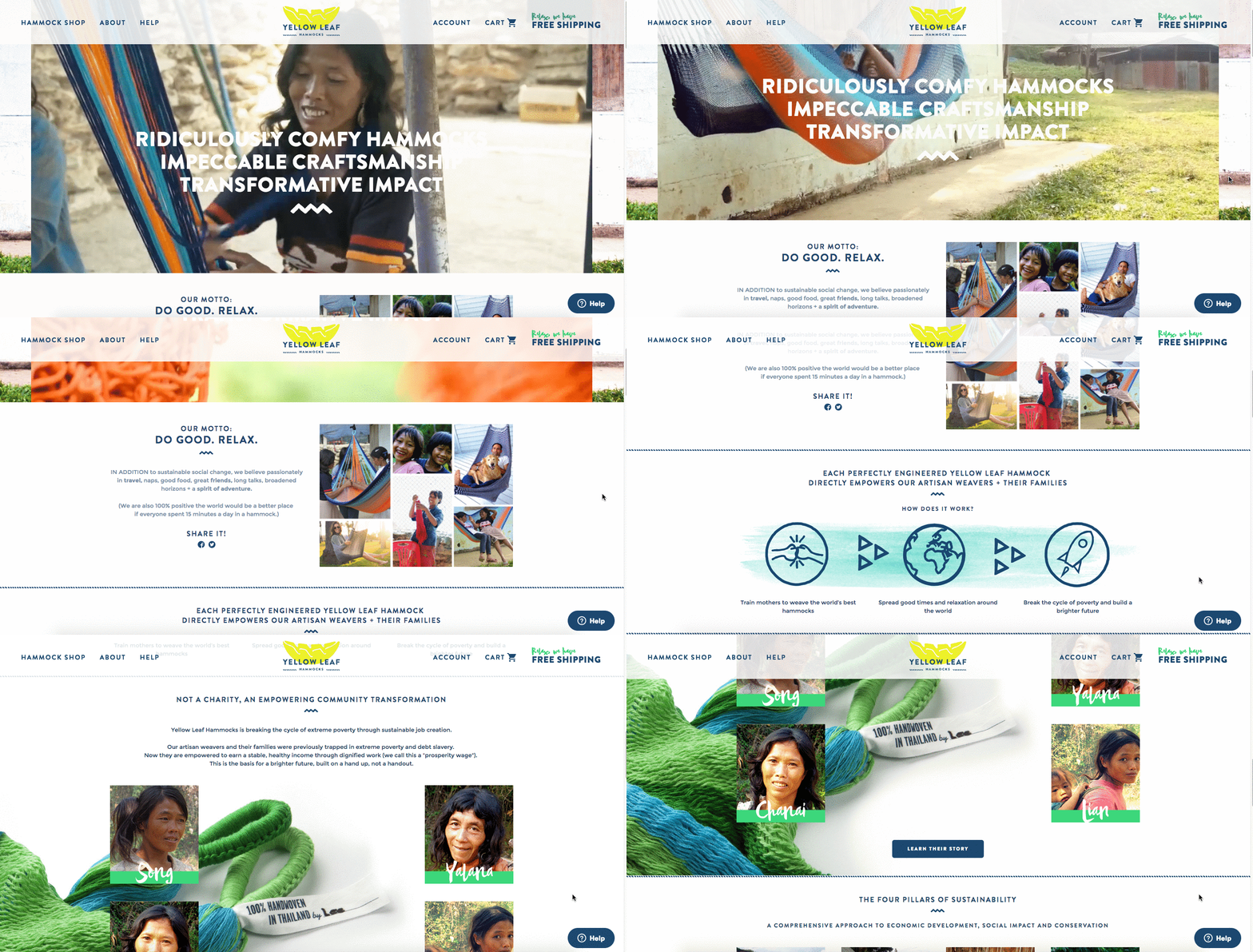
Yellow Leaf Hammocks tells users about its product by describing how the hammocks empower artisan weavers and their families. The company breaks down different pieces of the story into sections that combine words and easily digestible graphics, painting a picture instead of big chunks of text. They're clear about why they're different: "Not a Charity," the page reads. And then: "This is the basis for a brighter future, built on a hand up, not a handout."
Every company has a story to tell, so break out your storytelling skills from that random English class you took years ago and put them to work on your "About Us" page. Using descriptive and emotive copy and gorgeous graphics, an "About Us" page with a story works harder for your business than a generic one.
2. Eight Hour Day
Why the "About Us" Page Rocks: It's human.
People tend to think that "About Us" pages have to sound formal to gain credibility and trust. But most people find it easier to trust real human beings, rather than a description that sounds like it came from an automaton. Trying to sound too professional on your "About Us" page results in stiff, “safe” copy and design -- the perfect way to make sure your company blends in with the masses.
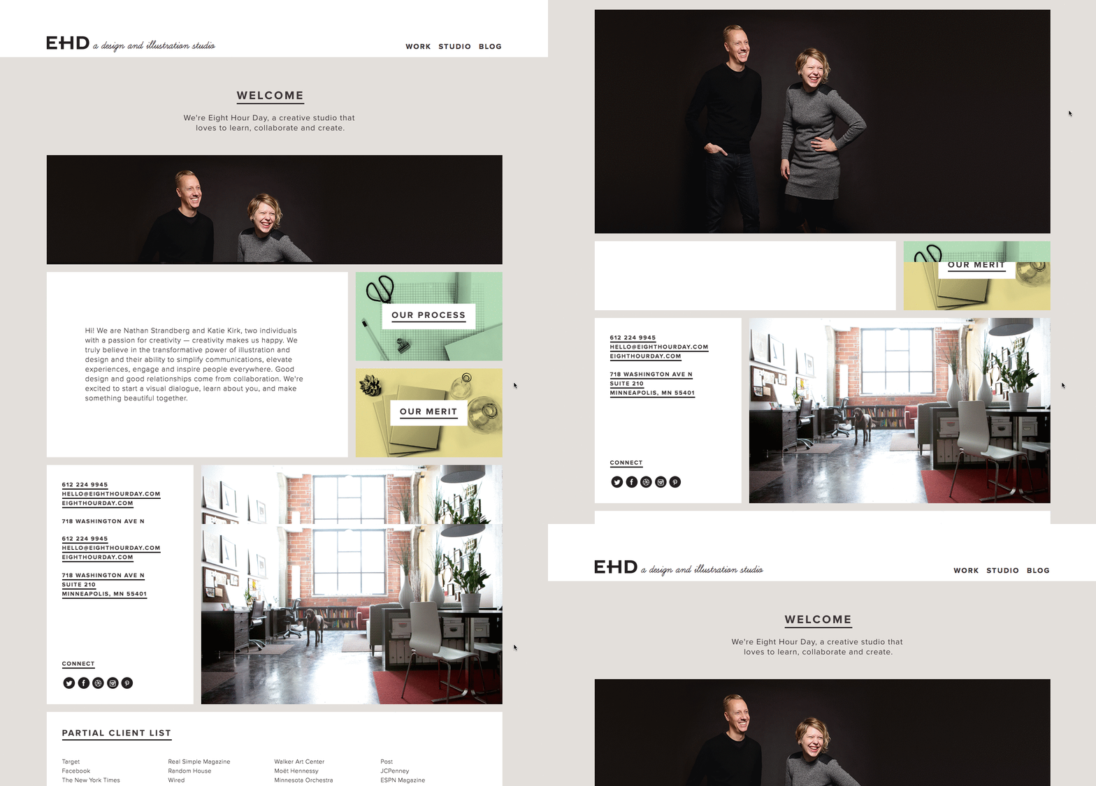
Instead, Eight Hour Day showcases the people behind the company and humanizes its brand. Introducing the founders by name and featuring the photos of them on the "About Us" page drives home the point that Nathan and Katie are -- as they so astutely put it -- "two individuals with a passion for creativity -- creativity makes us happy."
When you’re designing your "About Us" page,avoid industry jargon and replace it with an authentic voice -- yours -- to describe your product or service. Sure, it needs to be polished and free of errors, but it should always sound friendly and real.
3. Joe Payton
Why the "About Me" Page Rocks: It's confident, creative, and easy to skim.
"About Us" pages might encompass the values of more than one person or entity, but they're no more important to the image of a business than your personal about page. Take Joe Payton's "About Me" page, below.
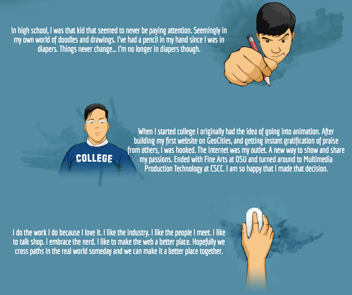
Not only does Joe's illustrative self-portrait give him a personal brand that customers will remember, but it also demonstrates his expertise as a designer and animator. His website visitors can learn not just what he does, but why he does it, in an easily digestible way. Being able to express his values as a creative professional in such a well-organized page is something to be desired by anyone creating their own about page.
4. Apptopia
Why the "About Us" Page Rocks: It skips the business babble.
We know -- no industry jargon. If you think it makes you sound super smart on your "About Us" page, think again. People want and appreciate straight talk about what your business does. After all, if people can't figure out what you do, how will they know they need your product or service?
So, skip the industry lingo -- that's what Apptopia does on its "About Us" page. The startup's simple but polished language effectively communicates the company's offering while still allowing the Average Joe to understand it.
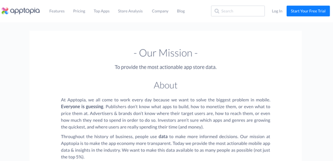
The moral of the story: Try to get rid of jargon on your "About Us" page whenever possible. Use short and punchy sentences to explain complex products and ideas in a way that isn't patronizing, but rather, is empathetic.
5. Moz
Why the "About Us" Page Rocks: It's humble.
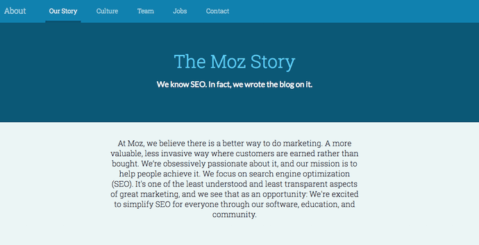
Instead of following the classic "About Us" script and writing a few paragraphs about the company's mission and origins, try something different -- there are plenty of ways to make your brand more compelling to someone who doesn't know about you.
Take Moz, for example. A lot has happened since it was founded in 2004, so the company chose to share those milestones using a fun and clean design that incorporates clear headers, concise blurbs, and little graphics to break up the text.
We especially love the humble references to how Moz received funding, how it switched its brand positioning -- and most importantly, how it switched back to its original model. This speaks volumes to the value honesty and humbleness can play to your customers. Don't be afraid to talk about your ups and downs; your customers will trust what you say that much more.
6. Aja Frost
Why the "About Me" Page Rocks: It's data-driven.
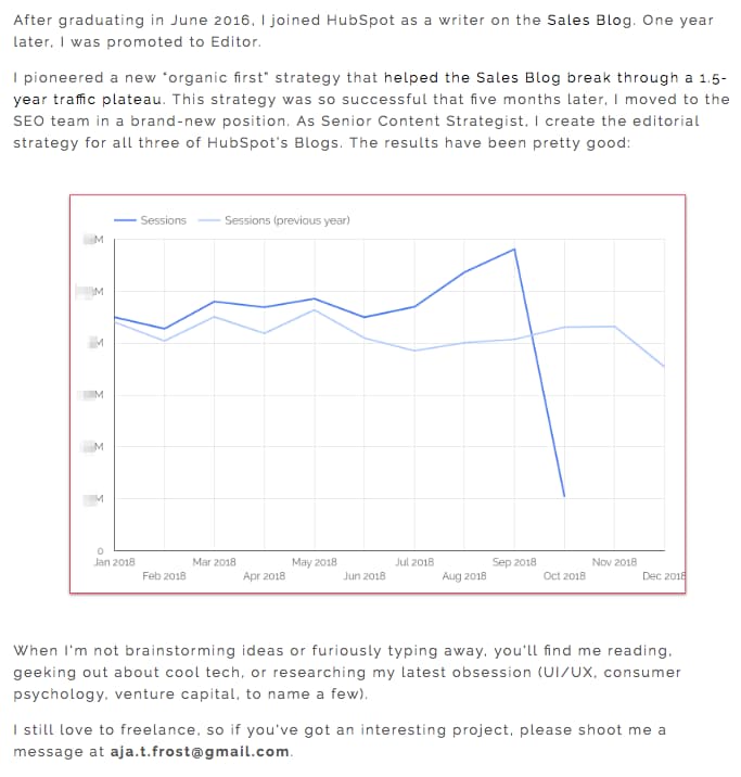
Alright, we might be biased in highlighting this professional, as Aja is our very own SEO strategist at HubSpot. Nonetheless, the ingenuity she brings to the company isn't lost on her website's "About Me" page.
Being a data-driven professional, Aja knows her own clients as a freelance writer and strategist don't just want to see what she's written -- they want to see how her content has performed. With that in mind, her "About Me" page tells a story of her career growth, which peaks -- no pun intended -- at an impressive line graph showing the result of an SEO strategy she implemented for the HubSpot Blog. (The graph's sharp decline at September simply indicates when she stopped collecting data.)
Following the impressive chart, Aja closes out her about page with a personal note on what she does in her spare time -- always a good way to humanize yourself in the eyes of your potential customers.
7. Cultivated Wit
Why the "About Us" Page Rocks: It breaks the mold.
Yes, this post is about, well, "About Us" pages. But sometimes, you don't always need to wait for users to get there in order to make a statement. That's part of breaking the mold to showcase your company's personality.
That's exactly what Cultivated Wit -- a creative agency and media company -- does, with both an edgy name and an incredibly fun story told through video and parallax scrolling ... right on its homepage.

Below is the actual "About Us" page, which is a gem once you get there. But it's great to see a company embrace its own brand of quirk throughout the site.
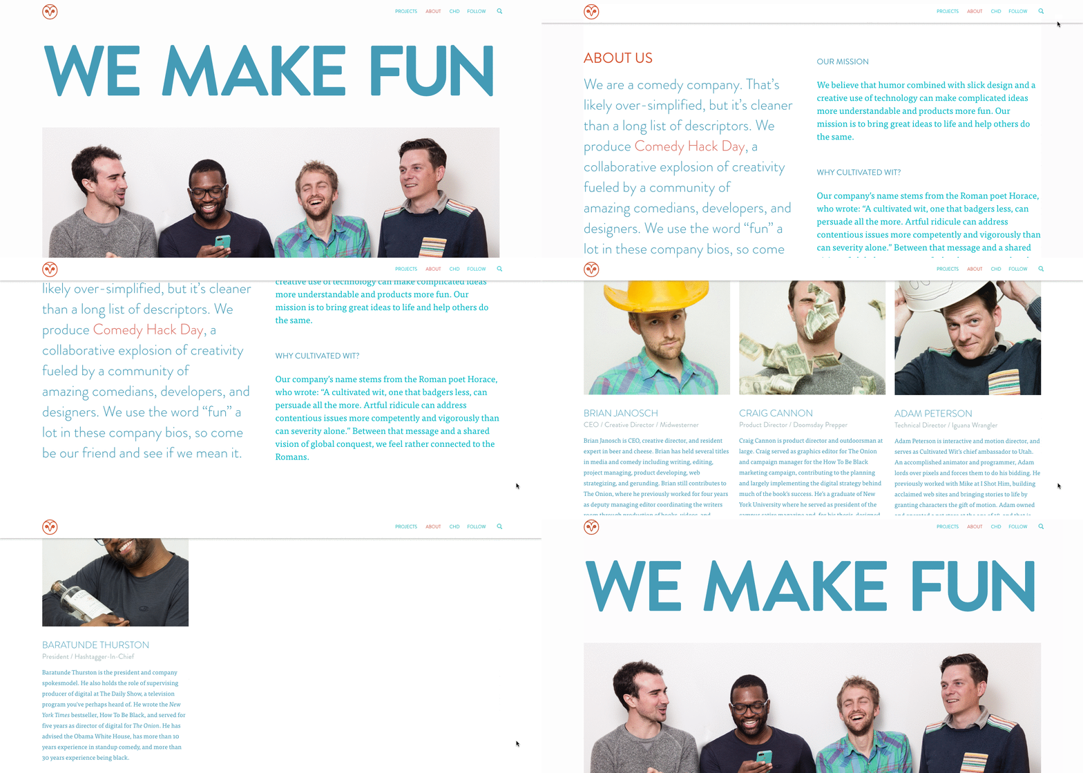
Even if you have a dedicated "About Us" page, there are plenty of ways to creatively showcase your company's personality throughout your entire website. And yeah, that's harder than filling a stock "About Us" template -- but it can have a significant payoff for your brand.
8. Kero One
Why the "About Me" Page Rocks: It's multilingual.
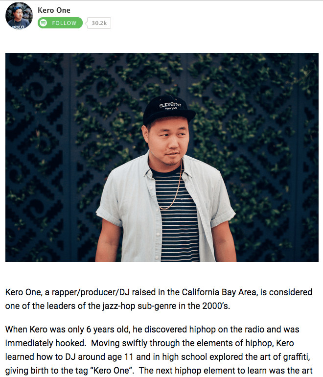
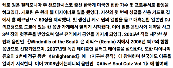
Kero One is a hip-hop artist and DJ from San Francisco, and his "About Me" page carries a valuable lesson to personal brands who cater to more than one audience -- especially if those audiences speak different languages.
Kero One's story starts at his childhood, when he was six years old and first discovered a passion for hip-hop. Knowing how old and genuine his love for the genre is adds tremendous value to his own music in the eyes of his listeners.
While this entrepreneur's childhood interests help to deepen his audience, the second screenshot below helps Kero One widen it. His "About Me" page first tells his story in English, then in Japanese, then in Korean, then in Chinese. Accommodating these Southeast Asian audiences makes his brand more inclusive of all the audiences he identifies with.
...
9. Nike
Why the About Us Page Rocks: It knows its audience.
Nike might seem like a company that's too big to inspire smaller businesses. You might even wonder if Nike even still has an "About Us" page. As a matter of fact, it does, and it hasn't forgotten the company's roots.
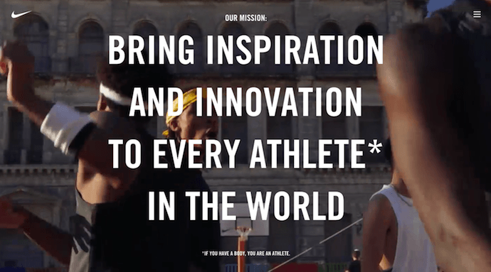
Nike began on the campus of the University of Oregon by the hand of the college's track coach, Bill Bowerman. And even though he no longer works at the company, one of his beloved quotes still brands the bottom of Nike's "About Us" page below: "If you have a body, you are an athlete."
This bold sentence, referenced by the asterisked "Athlete" in the words right above it, sheds important light on Nike's audience. The brand may be big today, but Nike is all about the rising stars -- who Nike depends on to, according to the rest of its "About Us" page, "expand human potential."
The takeaway for marketers? Know your audience, and make it obvious to that audience the instant they read about you on your website.
10. Refinery29
Why the "About Us" Page Rocks: It tells you what's most important.
Here's another instance where any area of your website -- not just the "About Us" page -- is an opportunity to break the mold.
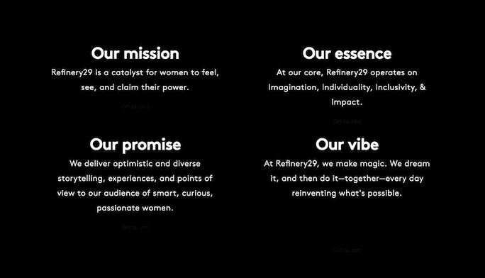
Many companies add just a simple mission statement or company profile, but people often don't want to ready a wall of text explaining what you do. So, Refinery29 broke it down to convey the intangible qualities that are tough to include in a basic "About Us" page.
Although Refinery29 does introduce its page with a description of its business, its goes out on a bang -- four bangs, to be exact. The organization is on a "mission," sure, but there's also an "essence" of Refinery29, a "promise" it keeps, and a "vibe" it gives off.
These aren't company traits you'd think to include when starting out, but they're what your customers often make gut decisions on when buying.
11. Sara Dietschy
Why the "About Me" Page Rocks: It has variety but still aligns with her personal brand.
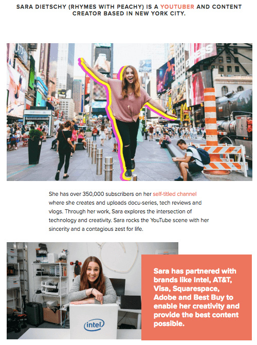
This professional YouTube content creator has an eclectic collection of videos related to technology and culture, and expresses that diversity all over her "About Me" page.
In addition to the vibrant self-portrait at the top of the page, Sara's first sentence tells you just how many people subscribe to her channel: 350,000. This is an important number to know for her potential video advertisers and collaborators who want to know how much exposure they'd get by working with her or advertising on her channel.
The colored tiles lining the page -- starting with the red one, as shown below -- also do a terrific job segmenting her work by the types of projects she takes up and for whom she's done them. That Intel logo in the second photo of Sara, below, is sure to turn some visitors' heads as they're perusing her website.
12. Marie Catribs
Why the "About Us" Page Rocks: It's unexpected.
There's a reason why these examples are exceptional -- "About Us" pages aren't always the most riveting parts of a company's website. In fact, they often look like an afterthought. But even if you don't have budget for juicy graphics, video, or parallax scrolling, there are other ways to make your "About Us" page unexpected with the copy alone.
Marie Catrib's is a restaurant, so you might think their "About Us" page would be your typical "here's how we started, here's what we believe in, and here's our food" story. Marie Catrib's "About Us" page does tells us that -- but it does so in an unconventional way. Immediately, the user's eyes are drawn to a header that says, "It's okay to make a mess, experiments can lead to beautiful things." Quite philosophical, for a place to have dinner.
But next comes the story about the owner, which starts in an unexpected way -- "It's hard to imagine, but at one time Marie was banned from the family kitchen." A line like that draws in the audience, because we know it's not going to be typical.
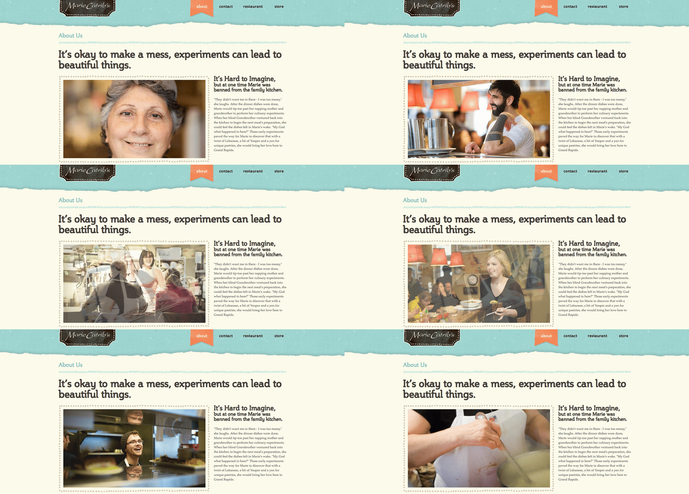
So, how will you use copy to really draw readers in? It's amazing what impression you can make on site visitors just by creatively telling your story with words alone.
13. Marc Ensign
Why the "About Me" Page Rocks: It's funny but professional.
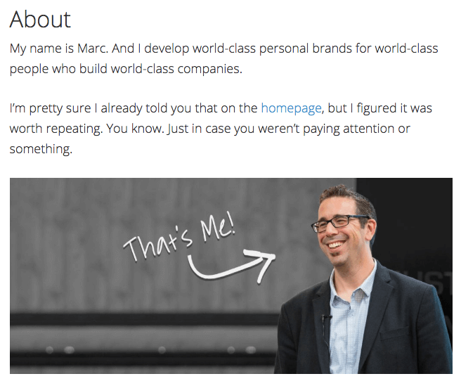
This branding expert does two things super well on his about page: He takes his work seriously, but doesn't take himself too seriously. Marketers know there's value to keeping a casual tone in the content they create, but in order to attract customers, you need to prove you have discipline and integrity. That's a tough balance to get right.
Marc Ensign nails that balance between friendly and formal with a confident opening statement, followed by an amusing smiley photo of himself to set an inviting tone.
14. Bulldog Skincare
Why the "About Us" Page Rocks: It's lovable and memorable.
What's the difference between "average" marketing and lovable marketing? It's the difference between creating generic webpages that provide great information, but in a straightforward, black-and-white kind of way -- versus creating webpages that provide great information and are infused with color, personality, and stay true to a company's unique brand voice. When you create lovable marketing, you can start a movement of brand evangelists and advocates who will help you grow.
Where does this fit into a company's "About Us" page? The folks at Bulldog, a men's skincare company that was named for the colloquial "man's best friend" -- a dog -- could have typed up a few paragraphs about where the brand came from and how they were one of the first in the space to redefine and eliminate stereotypes around men's grooming. But that text alone would have been a bit, well, average.
Instead, the "About Us" page is pithy, colorful, and leads with the lovable mug of an adorable bulldog -- fitting the name and the brand. And it states the purpose of the products -- to help customers from waking up with the (admittedly adorable) wrinkly face you see when you visit Bulldog's website.
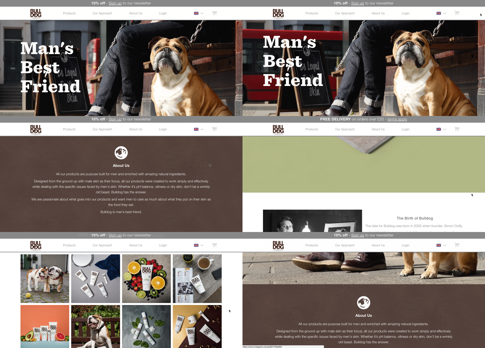
Play on your own words -- it's okay to have fun and pun with your brand, as it helps to inject personality and humor into your "About Us" page. It primes visitors for a story in a way that makes them immediately feel something. That's how you create memorable, lovable marketing.
15. Doomtree
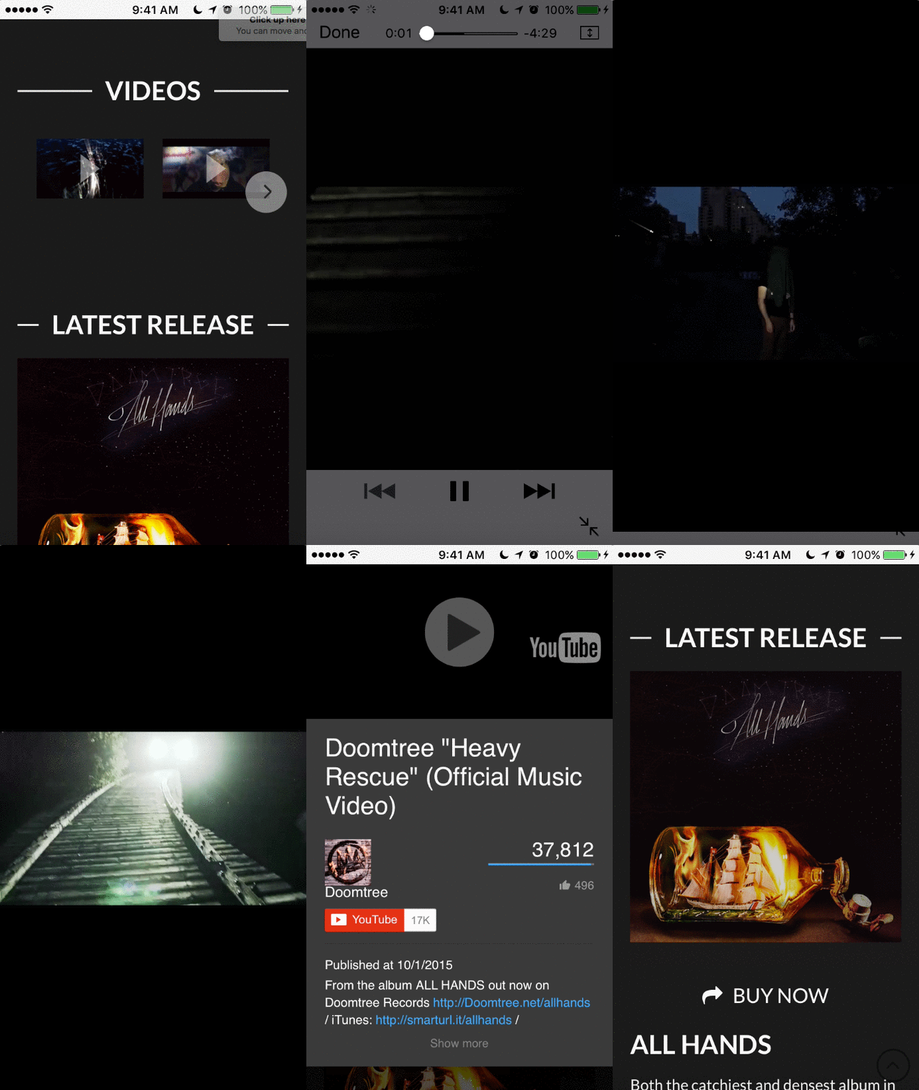
Why the "About Us" Page Rocks: Its shows, tells, and has a soundtrack.
One minute of video is worth 1.8 million words, according to Forrester Research's Dr. James McQuivey. But what about audio and visual, too, all combined with a really cool story? Well, that's one way to tell your story in an engaging way -- through multimedia.
Doomtree is built on a bit of an innovative concept: That a group of talented artists can each have thriving solo careers, but can still come together on a regular basis to create great music. It's not a band -- it's a crew. It's an unconventional concept with an equally interesting backstory that "started as a mess of friends in Minneapolis, fooling around after school, trying to make music without reading the manual." And as soon as you arrive on Doomtree's 'About Us' page, you're greeted with big, bold photos of those friends.
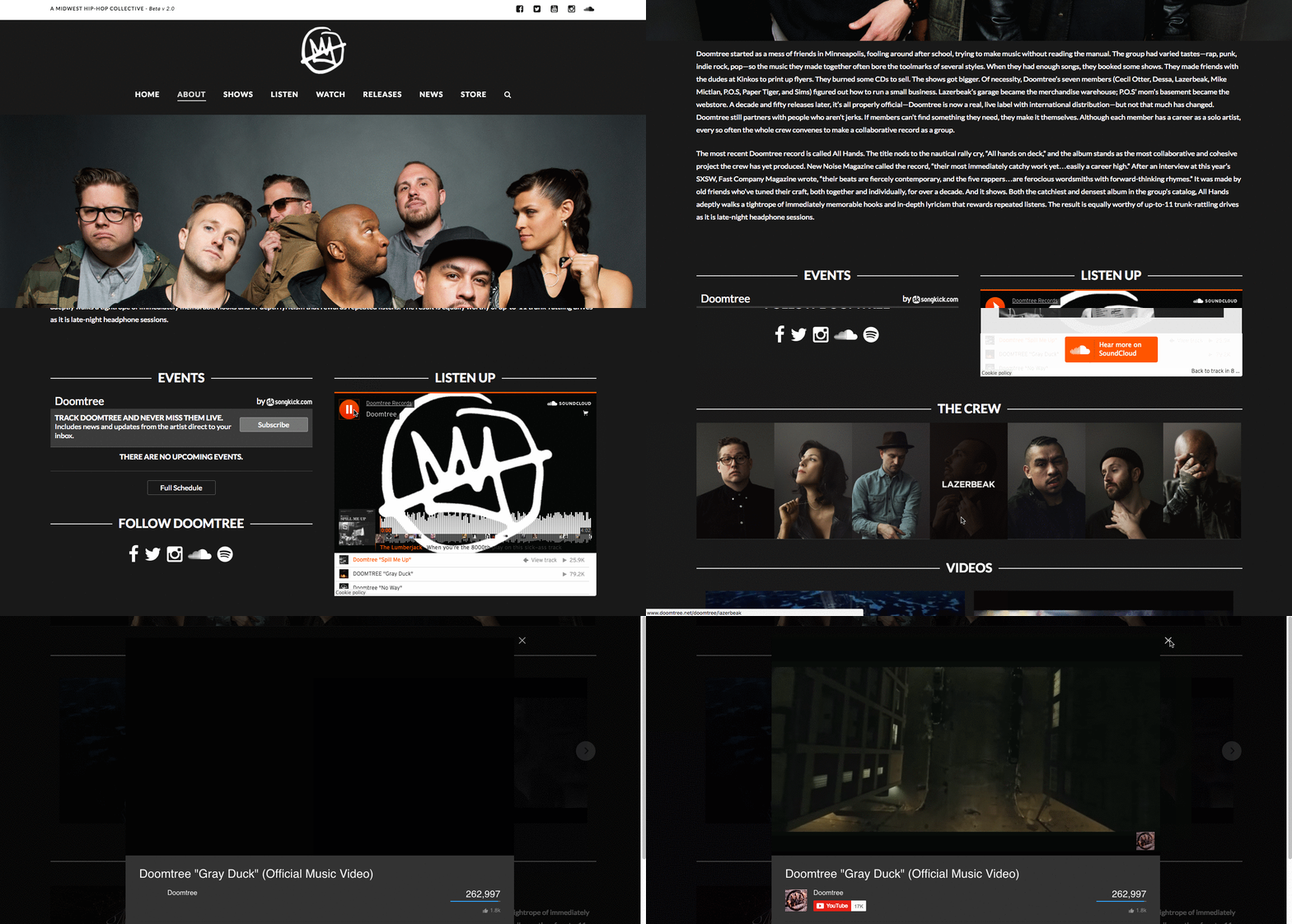
As you scroll down, users are treated to even more interaction with the crew's tracks and music videos. That makes sense, because it gives visitors an instant sample of Doomtree's product. What's more, the entire "About Us" page is responsive, including the video. That's important -- not only because it offers site visitors a great mobile experience, but also for Google search ranking -- especially now that such mobile usage has surpassed desktop.
16. Bold Xchange
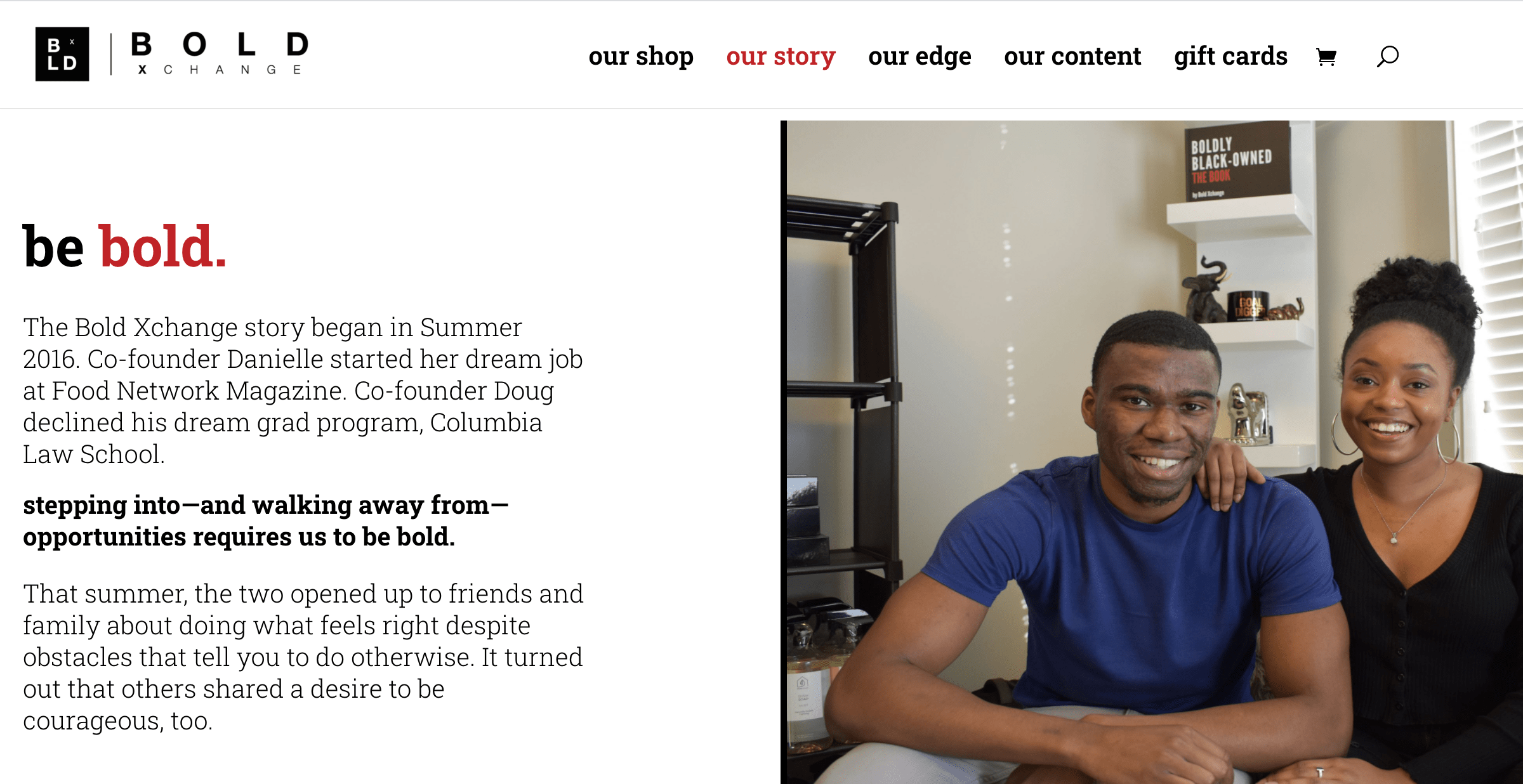
Why the "About Us" Page Rocks: It's sleek and focuses on the company's mission.
Bold Xchange's About Us page starts with a story of the co-founder's initial inspiration for starting the company: "That summer, the two opened up to friends and family about doing what feels right despite obstacles that tell you to do otherwise."
Sound familiar? The introduction immediately jumped out at me because of how relatable it felt.
The About Us page continues in story-format and is separated into three sections: "be bold", "stay bold", and "share bold". Along with a moving origin story, the page has a sleek design, with a red-and-black color scheme and authentic images to support each of the three sections.
What I like best about this About Us page is that it doesn't focus on what the company sells — instead, it uses the space to showcase the company's ultimate mission. When creating your own About Us page, consider how you might draw visitors in with an inspiring message upfront.
17. Ceros
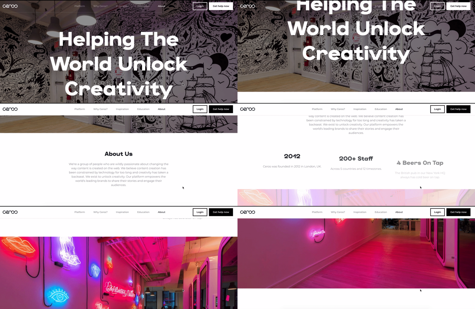
Why the "About Us" Page Rocks: It's interactive and funny.
Ceros' About Us page is interactive and engaging. As you scroll, the text slowly moves up the page, with bold — and humorous — statistics, like "4 beers on tap". Additionally, Ceros' uses images of their impressive, unique office space to further personalize the page.
Best of all, Ceros' keeps the text on the page short-and-sweet, with powerful statements like "We exist to unlock creativity". The Culture section further demonstrates Ceros' playful brand voice, with core values like "We wear our chicken suits".
18. Marketive
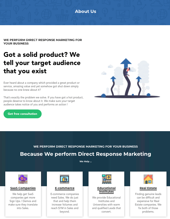
Why the "About Us" Page Rocks: It's compelling, with fun scrollable features.
Rarely have I seen a more powerful opening statement than the one Marketive uses in their About Us page: "Got a solid product? We tell your target audience that you exist."
Additionally, Marketive's About Us page displays original designs rather than photos to support the text, and the page is simply fun to scroll through. Plus, I appreciated Marketive's layout — starting with what they do, moving into which types of industries they help, and ending with the company's earlier milestones.
The interactive milestone calendar at the bottom is especially impressive. It authentically represents some humble beginnings (including two unsuccessful startups that inspired present-day Marketive), and features a fun scroll element that highlights various dates throughout the calendar.
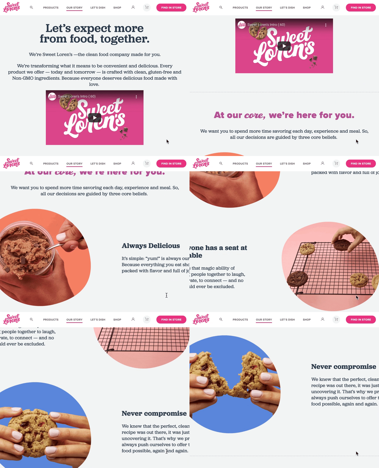
19. Sweet Loren's
Why the "About Us" Page Rocks: It's playful and reflects the brand's personality.
Start-to-finish, Sweet Loren's About Us page is playful, engaging, and colorful. The page starts with a 60-second video, and even incorporates cookie dough-scooping gifs. As you scroll, you'll move through some of Sweet Loren's impressive values, including inclusivity and refusing to compromise.
Best of all, Sweet Loren's yummy products are last on the page, ensuring you're fully primed to purchase only after learning about Sweet Loren's mission and differentiating factor: creating non-GMO, gluten-free, plant-based, and delicious cookie dough.
20. TalEx
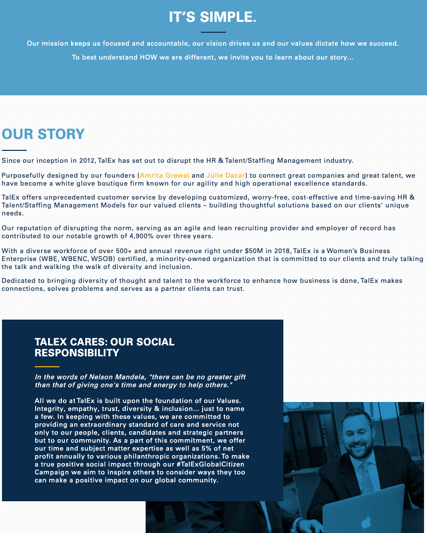
Why the "About Us" Page Rocks: It focuses on social responsibility.
TalEx has an interesting origin story, in which two women left a major recruiting firm to build their own and ended up landing AOL as a major client of theirs — which was previously their old employers' client.
TalEx has since seen unprecedented growth at 4,900% in the three years since it began. You'll learn all this and more on their About Us page, but what really makes their page stand out is the company's emphasis on social responsibility, which takes up nearly half the page and explains the company's dedication to giving 5% of its net profit annually to various philanthropic organizations.
21. SkinnyDipped
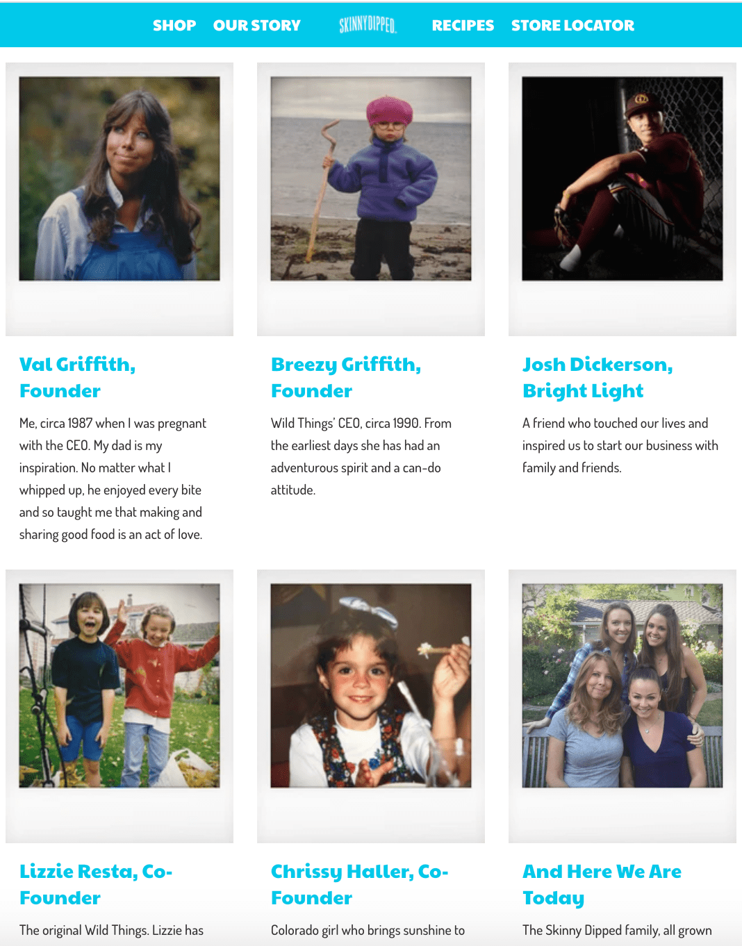
Why the "About Us" Page Rocks: It's authentic and down-to-earth.
SkinnyDipped's About Us page features a few sweet, polaroid images of the employees (including three of the co-founders as young children), and a moving nod to Josh Dickerson, a family friend whose death inspired the family to start the business.
Their About Us page is well-written and inspiring — for instance, they write, "We decided to start a business … That it would be centered around food was obvious. For us—family, friends, food and love are all tangled up." By the time you finish reading their story (and the individual employee bios), you'll be as impressed by SkinnyDipped's brand values as you are by their delicious products.
22. LoveBug Probiotics
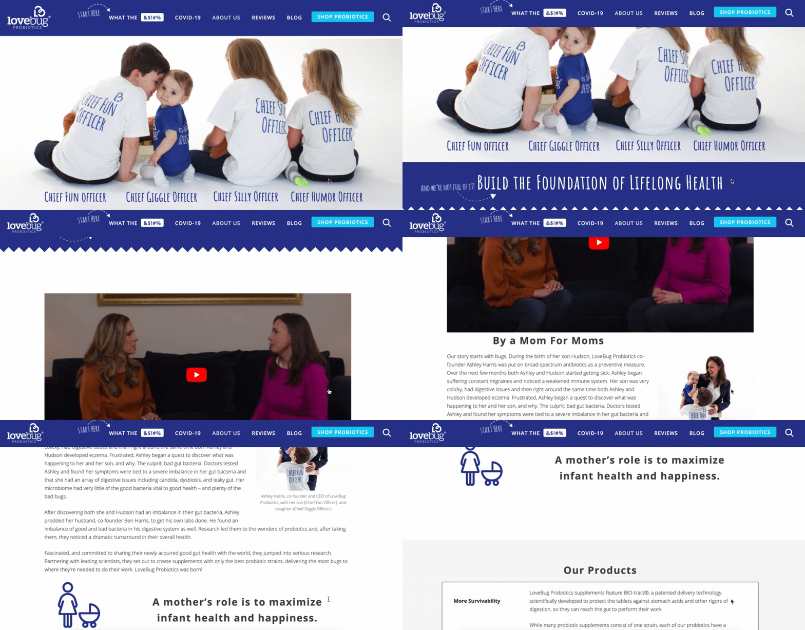
Why the "About Us" Page Rocks: It's playful and informative.
LoveBug Probiotics' About Us page features an image of the founder's four young children wearing "Chief Fun Officer", "Chief Giggle Officer", "Chief Silly Officer" and "Chief Humor Officer" t-shirts. I'll admit — there aren't many About Us pages with cuter introductions than that.
The page effectively includes all the information you'd need on the company to make an informed purchasing decision — including how the founder came up with the idea, her personal ties to her vision, the science behind her probiotics, and even an opportunity to find local stores that carry LoveBug probiotics.
Plus, while the products are science-backed, the About Us page doesn't confuse visitors with difficult-to-understand facts: instead, the page is simple, straightforward, and helpful.
23. Brown and Coconut
Why the "About Us" Page Rocks: It's simple and no-fuss.
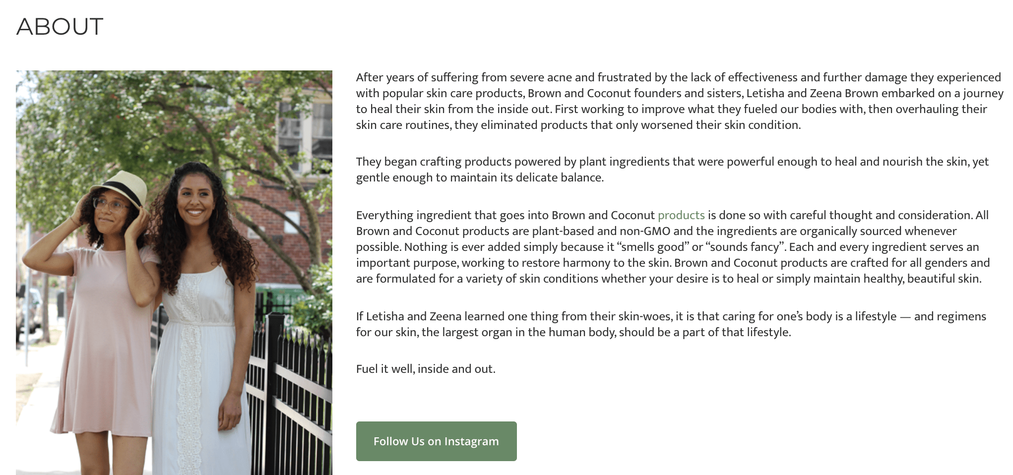
Sometimes, simpler is better — as is the case with Brown and Coconut's About Us page, which features a photo of the two co-founders alongside a few paragraphs of text, outlining the purpose and vision behind Brown and Coconut.
Plus, the opening sentence is incredibly relatable and draws the reader in: "After years of suffering from severe acne and frustrated by the lack of effectiveness and further damage they experienced with popular skin care products, Brown and Coconut founders and sisters, Letisha and Zeena Brown embarked on a journey to heal their skin from the inside out."
What I liked best about this About Us page is the simple, no-fuss language they used to describe their business. Plus, rather than ending with a CTA directing visitors to their products, the co-founders instead choose to include a CTA to follow their business on Instagram, promoting a likely more effective, long-term lead generation strategy that starts with brand awareness.
24. Kuno Creative
Why the "About Us" Page Rocks: It focuses on people rather than products.
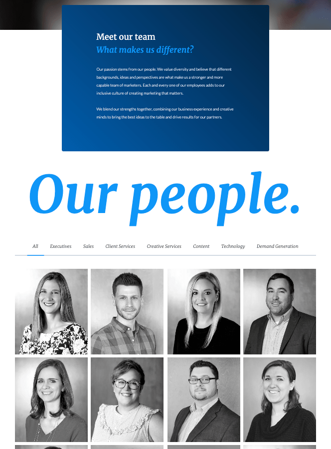
Kuno Creative's About Us page effectively focuses on what makes the company different: its people. While the first paragraph describes the origin of the digital marketing agency, the majority of the page is taken up by black-and-white shots of all its employees along with descriptions of each member, like a modern day yearbook.
Plus, the page looks sleek and clean, with plenty of white space and large blue lettering to draw attention without overwhelming visitors. If you're unsure what you want to include in your About Us page, consider taking note of how Kuno Creative focuses on its people, rather than its product, in the About Us page — a great way to humanize your brand.
How to Write an About Page
- Establish a mission statement.
- Outline our company story.
- Reveal how you've evolved.
- State your "aha!" moment.
- Explain who you serve.
- Explain what you're offering them.
- Cite examples of who you've served.
- Describe your values.
It's tough to establish one all-encompassing template for your "About Us" page -- there are just so many ways you can go about telling your company story. But, per the real "About Us" pages we've just highlighted, there are some steps you should keep in mind when getting started.
Here are five steps to writing an "About Us" page based on some of the things that impressed us about the examples above.
1. Establish a mission statement.
Your "About Us" page can and will be much longer than a single mission statement, but in order to draw people in, you need to succinctly state your goal in the industry up front. What are you here to do? Why should your website visitors care?
2. Outline your company story.
You might not have a long history of changes and growth your company has endured (yet), but it's a nice touch to talk about where you came from in your "About Us" page. So, isolate the milestones prior your company's founding, and use them to give readers some backstory on your current venture.
3. Reveal how you've evolved.
Even if you're a young company, there's no shame in admitting your business strategy -- or even personal way of thinking -- has changed since you began. In fact, in about pages, these evolutions can improve the story you tell to website visitors.
About pages are perfect spaces to talk about where you started, how you've grown, and the ideals that have helped your organization mature. Use these moments to further your company story and show people that you're always ready to change and adapt to the needs of your industry.
4. State your "aha!" moment.
Every good company was founded on an idea -- something the current marketplace might not yet offer. What was your idea? Use this "Aha!" moment as a pivot point when telling your company story. What was a challenge you faced while developing your company? How did this challenge or discovery shape what you are today?
5. Explain who you serve.
As much as you want as many eyeballs on your "About Us" page as possible, you won't do business with every single one of them. That's why it's crucial that you identify and mention your core customer. Who should care you exist? Which eyeballs are you here to serve?
6. Explain what you're offering them.
As you're explaining who you serve, make it clear what it is you're offering. Too often companies generalize their product or service in the language of their website, making it hard to understand what it is the customer is actually paying for. They're afraid literal explanations of their products aren't interesting enough, or will sound unappealing in writing. And that's a fair concern.
However, by investing just a sentence or two into telling your potential customers exactly what they'll receive can keep them on your website for longer and interested in learning more.
7. Cite examples of who you've served.
Got some loyal customers in your portfolio? Use your about page to let the world know who already trusts and benefits from your work.
Knowing about your company's past successes can influence the purchasing decision of up to 90% of today's B2B customers, according to Dimensional Research. Even if you don't yet have case studies to expand on the problems you've helped buyers solve, it's in your interest to briefly mention who you've done this for. And your about page is the perfect platform for it.
8. Describe your values.
Customers want to be treated like human beings. For that to happen, they need to feel that they're being treated by human beings. When finishing your "About Us" page, describe who you are as a person or a team, and what your personal values are. What's your company culture like? What bigger picture in life drives your business?
An LED lightbulb maker might sell 10 different lamp styles, for example, but that might not be the most important characteristic to its primary audience. Maybe this lightbulb developer was founded on a commitment to environmental protection, and every bulb the company makes was built by people who are dedicated to making the world more energy-efficient.
Keep in mind a secondary audience of your company's "About Us" page consists of your future employees. This is another reason describing your personal values is a good idea -- the key to your job candidates' hearts is to show them you have one too.
About Us Page Templates That Rock
Copy is an important element of an About page. However, you'll also want to keep user experience in mind as you showcase your brand story and identity to the world. Here are some of the top About Us and About Me page templates to use or draw inspiration from:
1. Sodium v2 (HubSpot)
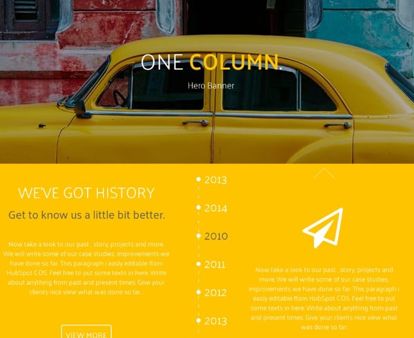
Tell your prospects about you using bold color and by telling your story. This template can help with that with its bold color (that can be customized) and timeline-like layout. Website visitors will know where you've come and where you're going.
2. Touraza Template (WordPress)
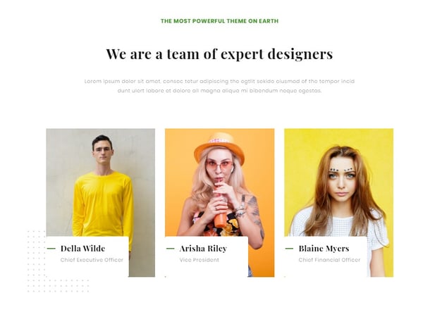
If you want something with a little flavor, the Touraza template is a good choice. With the "meet the team" section near the top with geometric designs and striking typography, you'll be able to showcase the humans behind your brand.
3. Logan Template (Shopify)
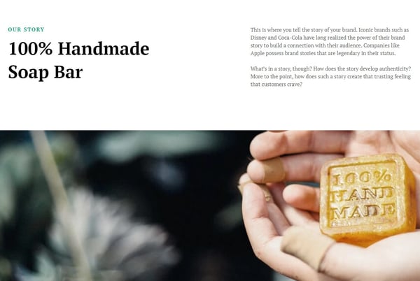
This template makes use of large images in a modern layout to break up the ample white space. The result: A clean and enjoyable reading experience. The top of the page puts the brand story (or other introductory text) first, supported by a large image that speaks for itself. The pops of color can be customized to your brand style, drawing emphasis to the most important elements you want to highlight.
4. Mercuric Modular Premium (HubSpot)
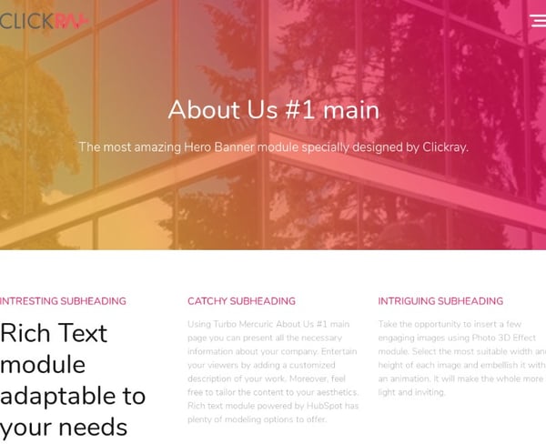
Make a statement with a stylish slider and smooth 3D animations. This template can be edited using user-friendly modules and other effects to catch your website visitors' attention. It comes with counter boxes, progress bars, and animated images for you to customize. There's also a full template pack for the other pages of your site.
5. Coax Template (WordPress)
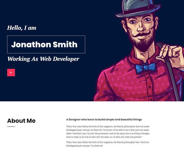
The advantage of the Coax template is that it's powered by Elementor, a page builder that makes customization easy. Even if you want to keep some of the defaults, though, this template is beautiful, letting the typography and copy take center stage. Ideal for a personal brand, you can choose to lay out your content similarly to a resume with big subheads on the left and descriptive text on the right.
6. Clean (HubSpot)
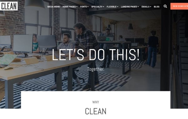
This template is 100% drag-and-drop ready, making setup a breeze. With an elegant header and overlay, you'll make a great first impression as you tell your brand story. Zero coding is required, it's completely customizable, and it's backed by a 100% happiness guarantee.
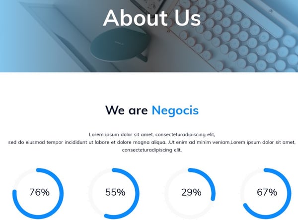
7. Negocis (HubSpot)
Do you think that your story is best told visually? This template supports icons and other elements that appeal to website visitors who want to understand your impact. It features image sliders, social sharing buttons, and more.
At this point, we hope that creating an "About Us" page doesn't seem like a daunting task -- rather, we hope you're ready to have some fun with it. With a good story to tell, creative copy, humility, and digestible visuals, you're on your way to an eye-catching user experience.
Even better? You're becoming part of the exception -- and standing out from a sea of "About Us" pages. What makes you different? We're eager to learn more ... about you.
from Marketing https://ift.tt/2iANych

No comments:
Post a Comment