They say a picture is worth 1,000 words. In reality, a picture is worth closer to 84.1 words depending on a variety of other factors, but let’s face it, that’s not as catchy.
The original point of the saying still stands, though: Images communicate information more effectively than text alone, and they’re best when working together.
And, brands agree with the statement above. In fact, in 2020, infographics were considered the third-most effective type of marketing content, just behind blogging and video.
But before you design an eye-catching infographic, you must first do the research to determine what story you’re going to tell, and how you’re going to tell it visually. And that research stage can be pretty tricky -- especially if you don’t have a plan.
That why we put together a helpful guide that’ll walk you through how to conduct research for an infographic, without driving yourself crazy.
Why Marketers Should Use Infographics
There’s a reason infographics are such a popular form of content: Viewers love, engage with, and remember them.
When people hear information, they're likely to remember only 10% of that information three days later. Meanwhile, if a relevant image is paired with that same information, people retain 65% of it after the same timespan.
This is clearly a type of content your readers search for, so how do you make an infographic that’s informative, beautiful, and shareable?
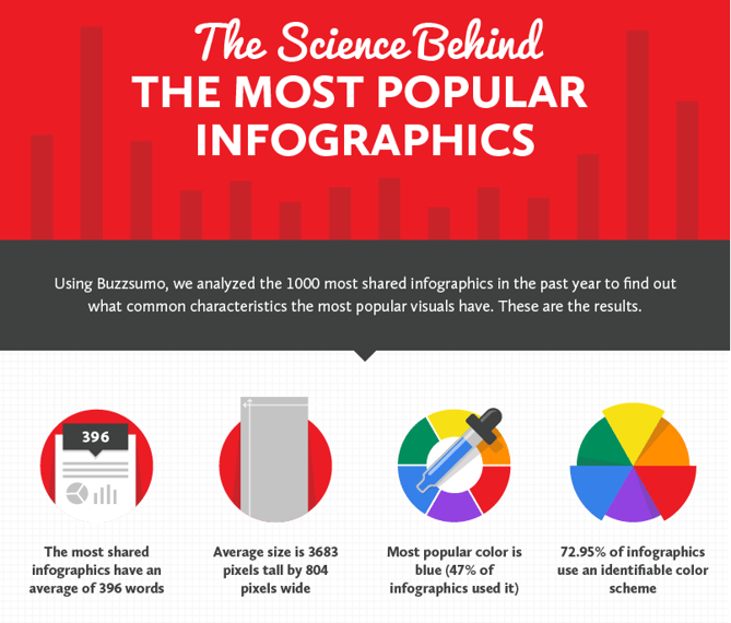
Siege Media conducted a study on what makes infographics inherently shareable (the results of which they turned into a great infographic of their own), and as it turns out, the most oft-shared infographics had an average of just 396 words. (For a point of reference, you’re almost 300 words into this article.)
That’s some seriously effective storytelling, and if you want to craft a killer story, no matter what the content format, you have to do great research.
You might think that all research is created equal, but there are specific tasks to ensure that you tell the right story for a graphical interpretation.
Check out our list below for tips on how to begin your infographic design journey with a strong foundation of research.
How to Conduct Research for an Infographic
1. Identify your audience.
Before you start conducting research on your topic, it’s essential to think about the audience who will view it. Market research is important because it makes you think beyond just one piece of content and instead about the impact it will have.
Questions content creators should ask themselves before starting infographic research include:
- Who searches for information on this topic? What are their ages, job roles, and demographic traits?
- What emotions do you want to evoke with your infographic?
- What do you want viewers to do with your infographic once they view it?
Tools:
- Google Images: Hop into this search tool and check out infographics on similar topics. Then, drop them into the search bar and conduct a reverse Google image search to see what sites link to these graphics. What do they have in common, and what trends can you apply to your research?
- HubSpot’s Buyer Persona Templates: These templates make it easy to keep track of what your audience is motivated by and searching for. Even though you’re not selling the infographic, if you’re using this content to attract potential customers, you’ll want to keep their objectives and motivators in mind.
2. Leverage keyword research to find image SEO opportunities.
Once you’ve determined who will be searching for your infographic, you’ll want to figure out exactly what they’re searching for.
In her article, HubSpot Customer Demand Manager Rachel Liest explains how to conduct keyword research for SEO.
Key to this process is starting with broad topics and potential search terms, then working your way to more specific terms using quantitative data.
Tools:
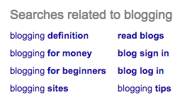
- Google Search: At the bottom of a Google search engine results page, a list of related popular search terms appears. Below is an example of my search for “blogging.” (Remember -- start with broad search terms.)
- Use the related search results to dig into the information your audience searches for so you can better tailor your infographic research.

- Google Trends: This tool shows you how searches for a specific word or term have evolved over time. If searches for a certain term are increasing, that may be an angle to pursue in a piece of content.
Below is the search history of “blogging” over the past five years. From this result, it’s reasonable to assume that search volume for this term is on a slight decline, and that my research process could benefit from more specific search terms to really pinpoint my audience.

- Google Ads Keyword Planner: This tool shows you the search volume of terms compared to similar terms. This is helpful to determine which words or set of several keywords, or long-tail keywords, are the most popular in search. These long-tail keywords will help determine the angle your content should address.
- HubSpot SEO Marketing Software: If you're a HubSpot customer, this handy app has several of the above capabilities already built-in. You can use the tool to conduct general keyword research and narrow your focus when selecting a topic. For example, I once searched for “blogging” and found that “how to make money from blogging” has a high number of search terms, so I might consider that angle as the topic of my infographic.
3. Keep search terms broad to find lots of data.
Once you start to conduct research on the topic of your infographic, don’t limit your content by what angle you think the infographic should pursue. It’s smart to do general research on a topic so you gain a basic understanding, but be mindful that it can influence the information you’re searching for.
For example, if you decided to focus your infographic on how to make money from blogging and only researched advertising as a means to achieve that goal, the data you pull won’t provide all of the information necessary to create a comprehensive infographic.
Research a topic, not a particular story or angle, until you have more concrete data.
Tools:
- Google Scholar: This resource serves as a great place to start your research. It’s a free search engine of scholarly literature on a variety of different topics and disciplines that will give you an idea of the type of data aggregated on the topics you research.
- JSTOR: This tool provides a database of primary resources, such as journals, original research, and books. You may need to purchase login access ($19.50/month) or log in through the credentials of an academic institution you’re associated with.
- Harvard Business Review: HBR is a scholarly magazine that publishes research, case studies, and statistics on a variety of different topics, including business, leadership, strategy, and economics.
4. Pull data from reputable, original, and validated sources.
When you find data during your research process, we recommend the following standards to decide whether or not to use it in your content:
Is it original?
Find the original data source for any statistics you encounter during your research process. Due to the plethora of different blogs and news outlets, many different websites can cite the same statistic without citing its original source. If you find a compelling data point that you want to use in your infographic, trace it to the original research source.
If you can’t find the original source, the statistic is unsubstantiated and shouldn’t be used.
Is it reputable?
Another question to ask yourself when conducting research is where you’re conducting research. Any individual or organization can start a website and publish content, but that doesn’t mean all content on the internet can be taken as fact.
Vertical Measures recommends starting internet research on .gov, .edu, and .org sites, which are associated with governing bodies, educational institutions, and organizations with greater legitimacy than blogs or individuals.
Can it be validated?
Even if you find a statistic on a reputable source, you’re not done yet. Raven Tools recommends that researchers make sure to properly fact-check information they find by a) determining if it’s cited by any other organizations or b) checking the methodology of its original research. If the data point seems unreasonable, trust your instincts and dig deeper.
Tools:
- Pew Research Center: "From economic conditions, to political attitudes, to social media usage, the Pew Research Center website has a ton of free research that you can use to better understand your target market," noted HubSpot Content Strategy Manager Jami Oetting in her roundup of the best market research tools. Check out the full article for even more related tools.
- HubSpot Research: Our very own research hub offers free market research data and presentation tools to visualize your data.
5. Use recent data.
You've put time and resources into researching and designing a great infographic.
Make sure you cite recent data so other sources will be interested in referencing your graphic once it's published.
We recommend sticking with data that’s one to two years old so your graphic will be relevant for months to come.
As a caveat, some original research data that would make a compelling case for your infographic may have set the standard for its industry more than two years ago.
For example, I’ve referenced research on the curiosity gap that’s from 1994 in previous posts, as this original study coined the term that’s still used today.
The trick is to find more recent research that re-tests and substantiates the original theory so it’s a legitimate data point, instead of simply dropping an older statistic into your infographic.
Tools:
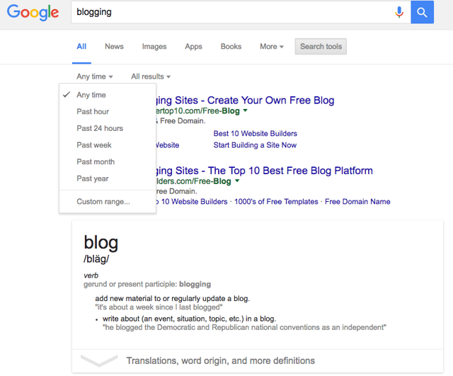
- Google Advanced Search: This feature allows you to limit search results to a certain timeframe to search for only the most recent info available. If you have trouble, widen the time range slightly. To set this up, enter a search term, select ‘Search Tools’ in the menu bar at the top of the page, and narrow your results by choosing how recently you want the data to have been published.

With the feature above, you can filter your search engine results according to when articles were published and according to their domains (.gov, .edu, .org, .com), among other features.
6. Imagine how your data could be visualized.
Remember what Siege Media found?
The most-shared infographics had an average of just under 400 words. This means that the graphics relied on data visualizations, charts, and illustrations to tell the data’s story.
Research for a blog post is different than research for an infographic because visitors expect to read a blog, but they don’t necessarily anticipate close-reading a graphic.
Think about data that can be turned into visuals while you research. Numbers, such as percentages, survey results, and change over time can be easily visualized using graphs and charts.
Are there categories within your data that you can visualize using icons or illustrations? Can you turn a multi-step process into a mini-graphic instead of writing it out?
Analyze all of your research findings wearing the hat of an illustrator and ask yourself if there’s a balance between data that can be visualized and data that must be written out.
Tools:
- Canva: HubSpot Senior Content Strategist Amanda Zantal-Wiener wrote an article about tools to make your own infographics, and Canva made the top of the list. Even if you won't design your infographic yourself, experiment with this design tool (and others on the list) to see how easily your data can, or cannot, be visualized.
7. Use the data you've compiled to craft a story.
When you think you’re done with your research, try to lay out the story that your graphic will tell. You may even want to storyboard your infographic: Write out your data points, and lay them out according to the order they’ll be visualized in the infographic. Does the story make sense? If the story isn’t clear or obvious, then you’re not done researching.
It’s easy to get stuck in the story you think your graphic should tell, but does your research data actually tell the story? Vertical Measures suggests that you let the research drive the topic and narrative of the infographic. If you’re stuck in what you think the data should be saying, you run the risk of citing your research in a way that manipulates the data.
If a data point isn’t self-evident as a visualization, it’s probably not the right data point, or it doesn’t have the right context. Go back and gather more research if you can’t craft a story that makes sense with just the data -- If you have to fill in too much with text, it will make for a visually unappealing and potentially incorrect infographic.
Tools:
- Trello. This interactive planning and organizing tool lets you create cards that you can move around your board to organize in any way you want. You can storyboard using Trello by creating cards with different statistics on them and rearranging them to create a skeleton for your infographic.
- Index Cards: Okay, so this one requires you to get a little crafty, but it's actually my personal favorite method. Write out the key facts of your story and start laying them out on your desk to get an idea of your infographic’s flow.
8. Choose a provocative fact to anchor your infographic.
Strong infographics are loaded with interesting data that’s beautifully illustrated. These infographics are shared when they prompt an emotional response.
Content that shocks, disgusts, saddens, delights, or scares people performs well: Researchers Jacopo Staiano and Marco Guerini found that content that prompts feelings of valence, arousal, and dominance tends to go viral.
Additionally, in an analysis of photos shared on Reddit, Fractl found that positive emotions were most likely to generate virality, but that content that provoked negative emotions with the right combination of arousal and dominance could be hits as well.
Raven Tools and Killer Infographics suggest finding a data point that gets to the heart of the topic you’re tackling to hook your reader and incite an emotion that will make them share your graphic. Then, use that hook as the infographic’s visual focal point, and build the rest of your story around it.
Check out Siege Media’s meta infographic about what makes infographics popular. They visualize and highlight the most surprising findings first to keep viewers scrolling, and then break down each finding with more research results.

Tools:
- Google Search: To avoid being repetitive, “[topic] + infographic” to see what else is out there. Ask yourself: Has this angle already been covered, or would you provide a unique view on the topic?
9. Get feedback from your peers.
This may seem obvious, but feedback is a critical step in determining when the research phase is over and when writing and designing your infographic can begin. Before presenting a design proposal to your manager or client, tap your peers for their input. Ask questions like:
- Do you understand the story’s flow?
- Is the hook of the infographic interesting?
- Does this data need further explanation to make sense?
It’s often challenging to remove yourself from a project you’re immersed in to honestly edit it, so feedback during the research phase will identify any weaknesses that may need to be addressed with the help of further fact-finding.
Tools:
- Google Drive: Teams can provide feedback on documents and images by sharing them on Google Drive and leaving feedback comments.
- PDF Preview: This tool lets you edit image files and share them with your team for feedback. They can add comments or delete items from the infographic and share their feedback with you by sending PDF or JPEG files back and forth.
Ready to Research?
In most cases, great data is the foundation of a successful infographic, so it’s worth investing time and efforts in finding the most relevant, current, and credible information out there.
Key to the process is remaining open to letting the research inform the editorial strategy, instead of the other way around. And once you’re ready to start designing, check out these infographic examples, as well as these free infographic templates, for inspiration.
from Marketing https://ift.tt/30LFPfQ

No comments:
Post a Comment