My morning routine is generally pretty straightforward: I wake up, do yoga, shower and get ready for work, then visit my favorite music websites to get my daily fix on the latest news.
Usually, when I sign onto these sites, I start scrolling as soon as the webpage loads. Not because I want to check to see if my trackpad is working, but because I know that to get to the content, I need to scroll a little. This routine has led me to mostly ignore what's usually right underneath the navigation bar: a banner ad.

I don't purposely ignore ads, I just want to get to my content faster. What I'm participating in — by mentally blocking out this banner ad — is called banner blindness, and may be a reason why your banner ads are underperforming.
When people ignore ads, the advertiser doesn't earn revenue or generate interest in the company. If you've noticed that your banner ads aren't performing well, it might not be due to the design, but because of something out of your control.
What is banner blindness, and why should you care? We'll cover that in this post, as well as how to avoid it.
When banner blindness occurs, it's can be because the webpage visitor is looking for something specific and doesn't want to get distracted by an ad. Even though the contents in the banner section of a webpage might not contain an ad, they're still liable to be ignored.
To illustrate, let's say I wanted to catch up on some news. When visiting a new site, my goal would be to quickly scour the daily headlines as soon as the page loads, so I would instantly scroll past the banner portion of the site to do that.

In this case, the banner information was an ad for The New York Times. In this scenario, I didn't engage with the ad for two reasons: it wouldn't help me accomplish my goal to read the daily news, and it isn't engaging enough to divert me from that goal.
This doesn't mean the ad isn't good, by any means. Though poorly designed ads do contribute to banner blindness, in this situation, the ad looks like … well, an ad. As a consumer, I know ads are usually placed in certain areas, like the banner.
I was able to deduce very quickly that I was coming in contact with an ad, so I scrolled past it. When you're quickly searching for information, do you find yourself stopping to look at the banner ads? If you do, it means that you're one of the people who have learned to pay attention.
When I notice a website I frequently visit that consistently shows banner ads, I learn to stop looking at that section of the website when I visit. Even if the banner section of that website stopped showing ads, I still wouldn't take notice of that section.
If you're advertising on mobile, it's a good idea to take into account that banner blindness occurs on mobile, as well. Mobile ads usually have special locations for ad placement, including the banner section of a webpage.
When you embed your ad, it's harder to ignore. It's generally larger than other content on the page, and because less information is presented on mobile, it's harder to separate the content from the ad. Also, the large placement of the ad means it would take more work to scroll past.
Ads that aren't engaged with result in a loss of revenue and conversion. What can you do to make sure people are looking at your ads? Let's briefly go over some strategies you can try to avoid banner blindness.
How to Avoid Banner Blindness
Even though you can't click a "Turn off banner blindness" button when finalizing your ad, there are some preemptive moves you can take to lower the probability of someone turning a blind eye to your ad.
1. Stray from the ad look.
If you can, try not to make your content blatantly look like an ad. Think of the website you're hosting on and what colors they use on webpages. If you incorporate a similar color and design copy, your ad wouldn't be as disruptive as, say, a bright green banner ad on Facebook.
While ads that are bright and colorful stand out, that might not be the best-case scenario to combat banner blindness. It could alert customers visiting the webpage for the first time that they're looking at an ad and scroll past.
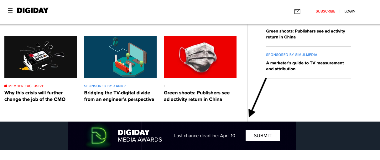
For example, let's look at this Digiday ad:

This ad, displayed as a banner in the middle of the webpage, isn't as easily noticeable. It uses neutral colors, little text, and blends into the page as a result.
2. Test your ad effectiveness.
Consider running an A/B test with a set of your target audience. This test will let you know if your ad is effective among users. So, even if audiences do have banner blindness, you'll know you have a lesser chance of that happening with the right ad.
Running an A/B test consists of showing a test audience two different types of ads to see which one they respond to more positively. Plus, if you use marketing software, it might have an A/B test tool built into the system. For more information about how to run an A/B test, check out this instructional post.
3. Choose another option.
Instead of banner ads, ask yourself if there's another ad format you can use to meet your campaign goals. Different ad formats may be less prone to be ignored (and less expensive than an entire banner).
Websites often have a variety of different ad options, like sidebar ads, and ads that occur in the middle of a webpage. In the New Yorker example, I was more drawn to their ad at the top left of the webpage, rather than the New York Times ad.

Even though it was a smaller ad, it was in a place ads normally weren't, so I was inclined to shift my focus.
Ads aren't always a guaranteed hit, but there are some steps you can take to make sure your banner ads are getting seen. After all, when you design an ad, so much work goes into making it awesome, and your audience deserves to see it!
Tomorrow, when I peruse my daily music news, I'll spend some time looking at the roll of banner ads. Will I see yours?
from Marketing https://ift.tt/2JS4gyM

No comments:
Post a Comment