Nowadays, users have become increasingly reliant on an easy form design.
The design of your form has a surprising amount of power in the conversion process. A well-designed form shows users early on that your business is helpful, tech-savvy, and easy to work with.
A poorly-designed form, on the other hand, could lead to page abandonment, a frustrated user, and a major decrease in sales -- in fact, Expedia figured out they were losing $12 million a year in profits, from one extraneous field form box alone.
A form is a critical step for converting users into customers, so you want to make yours easy, impressive, and sleek. Here, we’ll explore nine best practices of form design to boost your conversions and help you achieve an exceptional user experience.
Form Design Best Practices
1. Less is more.
We’ve all been there -- you’re all set to check out, and then you see the form fields required and think, “I don’t have time for this. Maybe I’ll come back tomorrow.”
If a form asks for too much information up-front, you risk losing out on a ton of conversions -- and it’s likely you don’t even need much information beyond name and email, at least initially.
Imagescape was able to increase conversion rates by 120%, simply by reducing their form fields from 11 to four.
If you’re unsure which form fields you should leave and which you should take out, consider using smart forms to ensure you’re never asking the same questions twice. You might also A/B test different form fields, to ensure none of your questions are swaying users from completing the field.
If you think one form field question doesn’t matter that much, you’re wrong. Expedia took out the optional form field “Company”, and increased their yearly profit by $12 million.
2. Use one column, not two.
If you’re deciding between one column for your form fields or two, choose one.
A study by CXL Institute found participants were able to complete a single-column form an average of 15.4 seconds faster than a multi-column form. For your users who will abandon the screen if a form takes too long, this additional time is too precious to pass up.
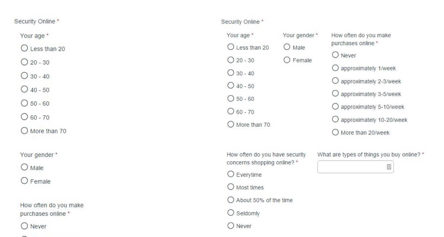 Image courtesy of CXL Institute .
3. Forms should be ordered easiest to hardest.
There’s something in psychology known as the foot in the door technique, first coined by Freedman and Fraser in 1966, which assumes if someone agrees to a small request, they’ll eventually agree to a larger one. And, as you might’ve noticed, there’s a lot of overlap between psychology and marketing.
Use this principle with your forms by including easiest form field questions (name, email) before harder ones (billing information). As your users begin filling out the form (“Okay, I can easily add my name and email”), they’ll become less likely to leave the page.
If the first form field is a hassle for them (“Shoot, I don’t even have my credit card nearby”) they’re more likely to abandon the page if they haven’t already invested in filling out the other half of the form.
4. Use inline form field validation.
Ultimately, you want your field to be helpful to the user. If it feels like a pop quiz they haven’t studied for, they’ll leave -- plus, if they’re engaging with your services for the first time, you’ll want them to feel impressed, not frustrated.
As reported by Baymard Institute, in 2012, only 13% of checkouts had live inline validation -- in 2016, that number rose to 60%. As your competitors begin implementing the strategy, it’ll become even more critical to ensure you incorporate inline form validation.
An inline form validation is a process where the user’s information is checked live as she moves throughout the form -- if she suddenly puts an incorrect credit card number, for instance, red text will appear below the form field, so she doesn’t have to reach the bottom before learning it can’t process.
For instance, check out Wayfair’s payment form -- when I input an incorrect credit card number, it notifies me immediately, saving me the trouble of having to re-fill in all the subsequent fields after clicking “Save & Continue”.
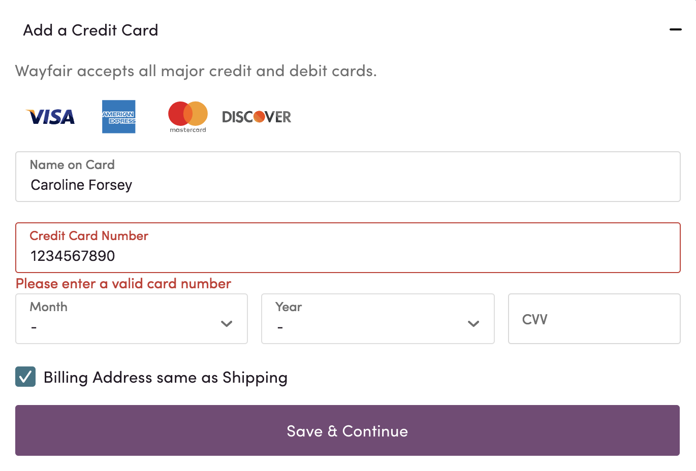 Image courtesy of WayFair .
5. Align text to the left, and above the form field box.
University of Basel researchers found aligning your text on the left-side, above the form field box, increases form completion time. This alignment decreases the amount a user’s eyes need to jump across the page, and makes the form more cohesive.
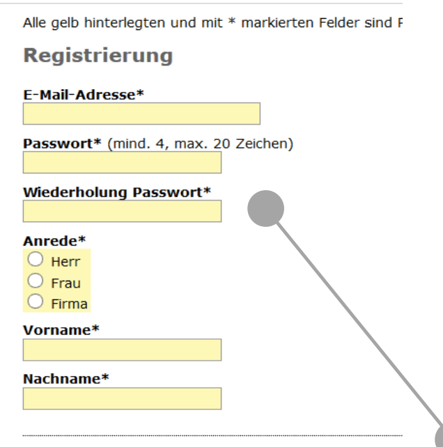 Image courtesy of Designing Usable Web Forms .
6. Title your form to motivate viewers.
Language plays a big part in form completion. Which form are you more likely to fill out, “Get a Free Guide Instantly” or “Sign Up”?
Ultimately, you’ll want to title your form with specific information on what the user will receive upon completion. By rewording your form’s title, you’re also differentiating yourself from every other online form that says “sign up” or “buy now”.
As a result of re-titling their sign-up form, BettingExpert increased their sign-up conversions by 31.54%.
 Image courtesy of Unbounce .
If a title is all it takes to receive over 30% more sign-ups, why wouldn’t you do it?
7. Don’t ask for a phone number (or, specify that it’s optional).
Unless a phone number is truly critical for your business, leave it out. ClickTale ran a test and found they lost 39% of user sign-ups when they asked for a phone number.
To combat the fall-out, ClickTale specified on the form that a phone number was optional. That one word, “optional”, nearly doubled their conversion rates and decreased that 39% loss down to four percent.
While it might seem harmless, giving out a phone number feels like asking for spam, and you don’t want to give users any impression that you’re a deceitful company. Ask for an email instead, and contact them that way (with permission). If they want to chat with a sales rep, they can call you.
8. Ensure a browser can auto-fill.
I haven’t filled out my address in months -- Chrome fills it in for me. Filling out a form is simpler than ever, now that browsers like Google Chrome or Firefox have autofill functions.
But a browser can only auto-fill if you use easily distinguishable context clues, like “City” or “First Name”. It’s best practice to title each form field with a term a browser will recognize, to help your users speed up their own fill-out process.
9. Address your users' concerns in the form design.
It’s easy to guess which concerns are most likely to deter potential customers from filling out your form. Most likely, they’re nervous about giving credit card information, or getting stuck in a yearly contract, which they can’t cancel.
FreshBooks addresses these concerns in their form, by including simple “No credit card required. Cancel anytime” text. Users are likely more comfortable including information like name and email, once they’ve seen they won’t accidentally get caught in a payment-trap.
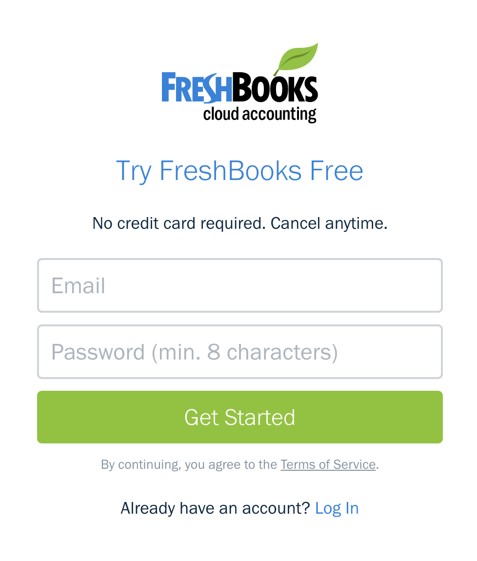 Image courtesy of FreshBooks .
Ultimately, your form should be designed and catered for your specific audience, and it’s important you conduct A/B testing and other market research when choosing your design. If you want additional inspiration on form design, check out 10 Web Form Examples You'll Want to Copy Immediately.
from Marketing https://ift.tt/2OEzPgG


No comments:
Post a Comment