Earlier this year, a handful of my extremely bright and capable colleagues compiled a report on topic clusters. Now first, what the heck is a topic cluster?
A topic cluster is a method that uses a single "pillar page" as the main hub of content for a given topic. All of your content assets related to that topic link back to the pillar page -- and the pillar links out to each asset.
Here's why it's critical to your content strategy.
Topic clusters aren't just a nice, clean way of organizing content that brings glee to the most Type A of marketers (me, for instance). It also keeps Google happy. As it turns out, the search engine giant has changed its algorithm to favor topic-based content, making pillar pages a requirement for content marketers who want to maintain a high SERP ranking.
Here's a handy video explaining how topic clusters work:
>Now, let's dive into what these pillar pages mean for your business.
What Is a Pillar Page?
My colleague, Sophia Bernazzani, does an excellent job of summarizing pillar pages (and comparing them to HubSpot Marketing Blog's own previous method of topic organization) in her post on the subject here. As the previous paragraphs suggest, she says:
"A pillar page is the basis on which a topic cluster is built. A pillar page covers all aspects of the topic on a single page, with room for more in-depth reporting in more detailed cluster blog posts that hyperlink back to the pillar page. Pillar pages broadly cover a particular topic, and cluster content should address a specific keyword related to that topic in-depth."
What's more, however, is that the idea of a pillar page is to cover broad content in a way that is highly linkable itself -- that is, external sites would link to it as a canonical resource for the topic. So, to put it into visual terms, here's what our blog architecture used to look like using this old playbook:
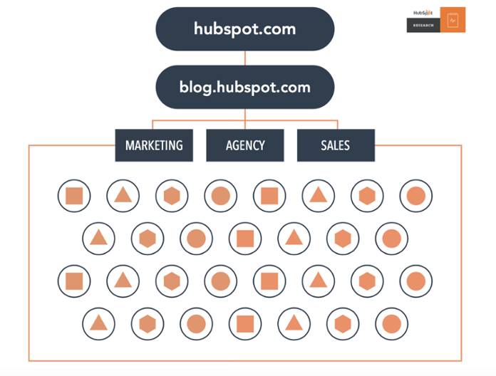
This is where the topic cluster model comes into play. Using topics you want to rank for, you can organize the mess of content above by optimizing it for specific keywords related to its respective topic. Then, hyperlink all of those topics back to a pillar page.
Think of this pillar page as a topic's mother ship, and your blog posts are all smaller soldier ships that give and receive support from this mother ship. This organization offers greater search engine authority because it tells Google you've dedicated a certain amount of digital real estate to this topic, and are to be considered a reliable answer to users' questions on that topic when they conduct a search.
Now, as we've established multiple topic clusters, here's what our blog infrastructure now looks like:
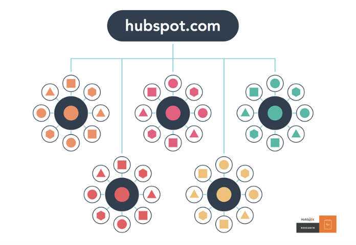
See how the site architecture is more deliberate in this model? The visual above shows how it organizes content assets together to help searchers more easily find information within your domain.
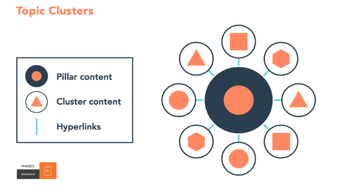
It has three main components:
- Pillar content (your pillar page)
- Cluster content
- Hyperlinks
Okay, you get it -- pillar pages are both nice and important for SEO. After all, on average, a page that ranks #1 in Google will also rank well for around 1,000 other related keywords. But what are they supposed to look like? Are aesthetics important? How do you organize all of your content assets on a pillar page?
Actions speak louder than words -- says the writer -- which is why we sought answers to those questions by way of pillar page examples that do an excellent job of organizing and linking to content assets.
7 Great Pillar Page Examples
1. Typeform: Brand Awareness
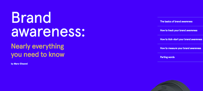
At first glance, it's hard to ignore the positively inbound-y nature Typeform's Brand Awareness pillar page. It was built to inform, and lives up to its tagline: "Nearly everything you need to know."
Not only is it aesthetically pleasing -- the color palette is, somehow, at once both soothing and bold -- but it's quite easy to navigate. The table of contents appears immediately, and once you begin to consume the content, it's clear, comprehensive, and quotable.
Typeform's Internal Linking Strategy
Notice how the information is interjected with CTAs to tweet various stand-out quotes:
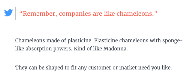 And while there are several links throughout the pillar page, the vast majority of them don't link to other Typeform content assets. In fact, it's not until toward the end of the pillar page that those links to other Typeform pages begin to appear, and even them, they're used sparingly, and typically used to support points and direct readers to solutions.
2. Matthew Barby: Customer Acquisition Strategies
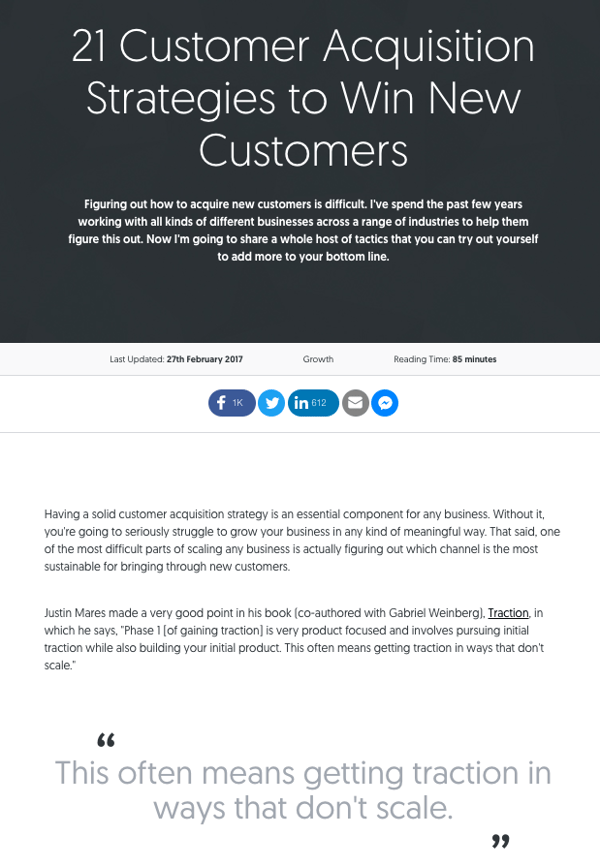
HubSpot's Global Head of Growth and SEO, Matthew Barby, is no stranger to the HubSpot Marketing Blog, or the people who comprise its team. We regularly quote him here, and frequently pester him with our own questions. Naturally, his website is a go-to resource for marketers who want to learn about SEO -- and it includes an exemplary pillar page on customer acquisition strategies.
Matthew Barby's Internal Linking Strategy
Similar to the Typeform example, there's a noticeable shortage of promotional hyperlinks within the first section of the page. In fact, as you scroll down the page, you'll also see that links to Barby's other content assets are both tastefully and seamlessly inserted between large pieces of tactical information.

But these links are supplemental and relevant, and there aren't tons of them -- all of them direct the user to Barby's tools on the topic at hand, which is customer acquisition. Instead of bombarding the user with numerous in-text links, well-designed CTAs are used to allow readers to click to learn about these tools.
3. HubSpot: Productivity Apps
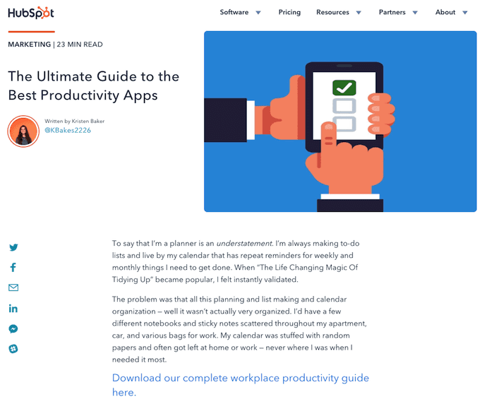
Sometimes, pillar pages can look like and belong to the same blog property for which it's building SEO authority. Recently, we adopted this concept in our very own topic cluster model. Above is our pillar page for productivity apps, a topic we know many of our readers care about and have questions on.
The pillar page above has a blog-like title, feature image, and byline just like the specific blog articles that belong to this cluster. It's also on the same domain as our blog content -- blog.hubspot.com. These attributes show Google there's a visible connection between the pillar, which is much longer than each blog post to encompass each topic, and the blog articles it links out to.
HubSpot's Internal Linking Strategy

In addition to the blue anchor text CTA to download related content -- as shown in the first screenshot of our Productivity Apps pillar page, above -- these pillars also link out to each page in the topic cluster using an RSS feed at the bottom of the pillar page.
In the screenshot directly above, you'll see each article belonging to the Productivity Apps cluster linked in a "Related Articles" carousel. This carousel allows us to link out to each article in this cluster as they're created, further strengthening the entire cluster as a result.
4. The Atlantic: Population Healthier

Pillar pages are also an excellent way to organize and create sponsored content with a co-marketing partner. Case in point: The Atlantic partnered with athenahealth to compile a report (and pillar page) on healthcare in the U.S.
The content is absolutely bananas -- in the absolutely best way possible. It begins with a story about a historical building in the Massachusetts town of Lowell, which forays into a full-blown interactive, animated, and highly information report about the state of healthcare coverage in cities like this one as the user scrolls down. But the entire time, there's a helpful plus-sign along the left side of the page that, when clicked on, presents a table of contents.
The Atlantic's Internal Linking Strategy
On The Atlantic's pillar page, links to additional content found on theatlantic.com are a bit more prevalent than the previous example. But remember, this pillar page was created to support sponsored content. Therefore, it presents an organized, non-intrusive way of linking to this sponsored (but still informative) content that relates back to the central topic of healthcare in the U.S.

The Atlantic achieves that by placing well-designed, but noticeable links at the end of each section. These lighter-colored boxes match the visual theme that precede them -- such as with the link to "The Culture Wars" content in the example above.
5. ProfitWell: SaaS DNA Project

We love content that makes good use of examples to point out best practices -- just have a look at what we're doing in this post. But in a move similar to Typeform's in its Brand Awareness pillar page, ProfitWell's pillar page on "The Anatomy of a SaaS Marketing Site" incorporates plenty of "in-the-while" instances of both what to do when it comes to SaaS marketing content -- and what not to do.
Building that sort of information into a pillar page -- or any content, for that matter -- preemptively answers the question of, "I know what I'm supposed to do. But what should I avoid at all costs?"
ProfitWell's Internal Linking Strategy
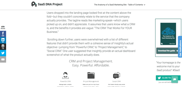
Once again, there's a noticeable lack of link inundation here. Within each chapter, a visual CTA lingers along the right-hand side of the page that allows users to download the full Anatomy of a Saas Marketing Site guide, as well as a single click-to-tweet option for one line of quotable text from the section. It's a no muss, no fuss approach that fits in well with a text-heavy site, which doesn't distract from the main content.
6. GoodUI: Evidence
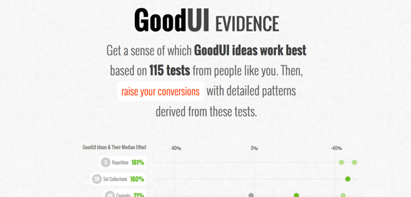
We're absolutely delighted by the concept of "Easter eggs" -- those little hidden, puzzle-like treasures on the internet that turn up cool tricks or nuggets of information. And to us, GoodUI's "Evidence" pillar page is one big Easter egg.
GoodUI's Internal Linking Strategy
The page consists of data -- or "evidence" -- from multiple A/B tests that have uncovered patterns for higher conversions. Clicking on any data point throughout the page will direct the viewer to an expanded, detailed view of the test leading to that information. It's a treasure trove of eye-catching, compelling experiment results.
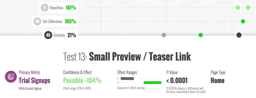
Within that sub-content, there's a CTA at the bottom of each dedicated test section to share your own test, providing the reader with an opportunity to contribute her own content and findings to an already impressive plethora of information.
7. GatherContent: UX Design and Content Strategy

I love this pillar page, because you can download it.
Pillar pages are designed to be the mother ships for the topics on which you plan to create lots of content, but they don't have to just be SEO builders. According to GatherContent's pillar page, shown above, they can also be lead generators.
This pillar page is a long, open document of subtopics about user experience (UX) design that doubles as a PDF you can download to your computer.
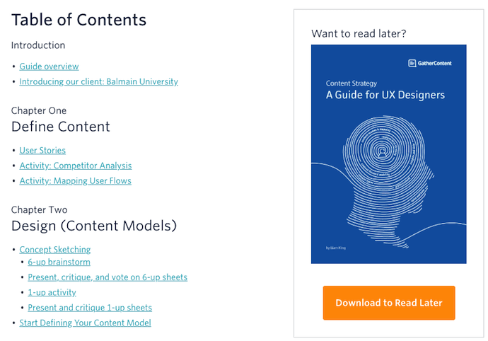
Take a look at the table of contents that comes after the title page, above. As you can see, you can download this guide to your computer (after entering your name and email address).
GatherContent's Internal Linking Strategy
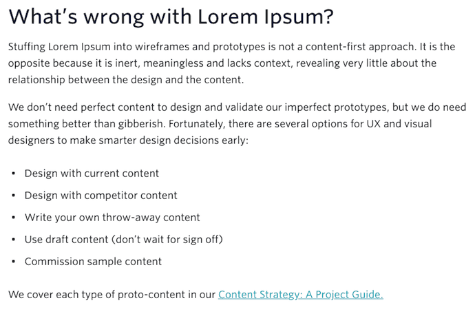
GatherContent's pillar page doesn't focus much on linking out to related content on UX design. Instead, it links to another guide on a related topic. There, readers will see a preview of a PDF they can then download using their name and email address.
This is an example of a content strategy that uses pillar pages to rank its lead-generating content directly on Google.
What'd you think? Which pillar page style interested you the most? No matter how you organize your content, a thorough pillar page is the support beam that helps you rank well in search across numerous topics across your industry.
from Marketing https://ift.tt/2wkeEWS




No comments:
Post a Comment