Marketers spend a lot of time trying to nail down abstract concepts. They're tasked with turning brainstorming sessions and comments sourced during focus groups into campaigns that sum up everything about a brand's identity in a neat, tidy, and most importantly, interesting way.
But what if a consumer could walk into a room and fully experience your brand with all their senses? Pop-up events offer just that -- the chance for consumers to get up close and personal with their favorite companies in a truly immersive setting.
In their simplest form, pop-up events are temporary retail spaces that give companies the opportunity to sell their products in an environment completely designed and controlled by them. Since they're temporary, they offer a relatively low-cost and low-commitment way for companies to take creative risks, generate buzz, and introduce their brands to new audiences.
Consumers love the lure of exclusivity, and brands love the unmatched opportunity for experimentation. To inspire your next branded experience, we've curated a list of 15 innovative and visually stunning pop-up events.
15 Examples of Next-Level Pop-Up Events
1) COS Los Angeles
Experimental architecture firm Snarkitecture was inspired by mirrored surfaces and simple silhouettes when designing this temporary retail space for LA-based fashion label COS. The folks at Snarkitecture transformed an empty industrial space into two identical, monochromatic rooms -- one white and one pale pink -- leaving the focus on two racks of minimal clothing. The reflected space "creates an unexpected and altered world for visitors to experience and share."
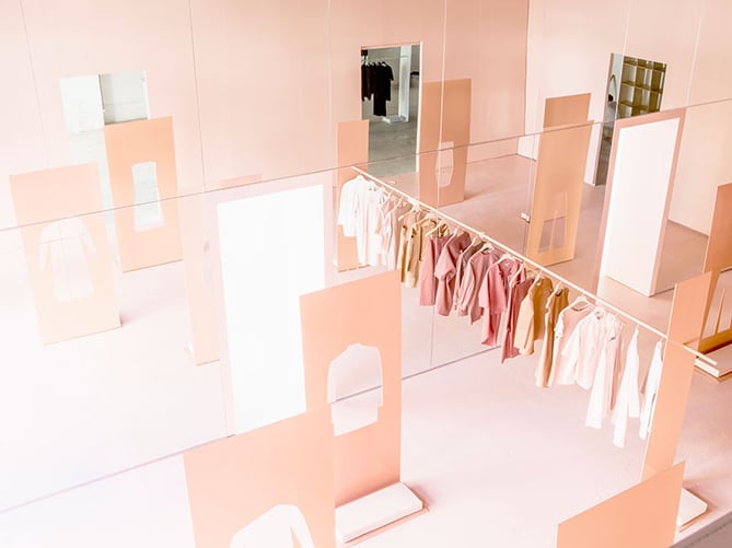
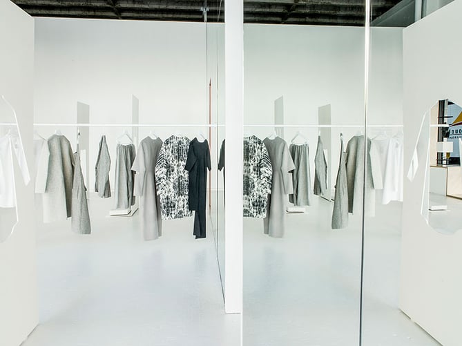
Image Credit: Snarkitecture
2) BarkShop Live
Shouldn't your dog be able to shop for his own toys? Bark & Co, the ecommerce company behind BarkBox, certainly thinks so. For one week in June 2016, the dog-centric retailer set up shop in Manhattan, inviting dogs and their owners to try out their squeaky, bouncy, and chewy offerings in-person. The lucky pups in attendance were fitted with RFID-enabled vests, which tracked the toys they played with the most. Owners were then able to view and purchase their dogs' favorite playthings directly from the event's custom mobile app.
Video from Digiday
3) Glossier Summer Fridays Showroom
In Summer 2015, online makeup and skincare brand Glossier styled a floor of its Manhattan headquarters as a temporary retail showroom -- the closest thing to stepping into its beautifully curated Instagram feed. The space offered Glossier products for sale, but as founder Emily Weiss explained, selling tubes of moisturizer and lip balm wasn't necessarily the pop-up's top priority. "It's not really just a store," Weiss said in an interview with Racked. "It's almost like this is a giant mood board for the company we're hoping to build."
Created under the direction of set designer Marguerite Wade, the penthouse featured custom floral arrangements by Meta Flora and an installation by multi-media artist Grace Villamil.
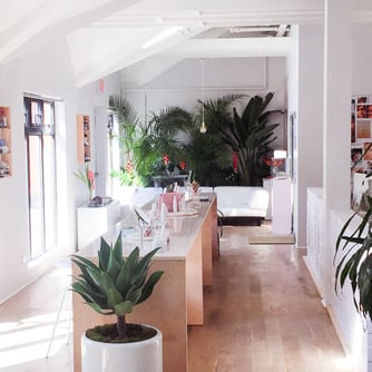
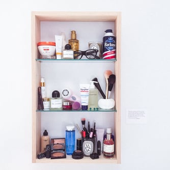
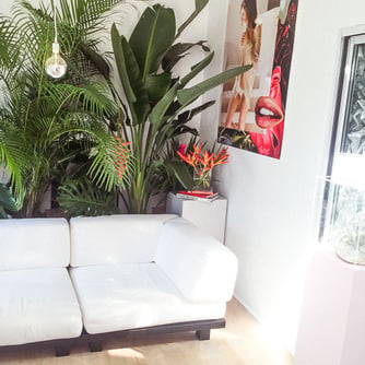
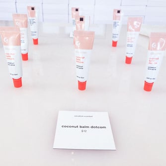
Image Credit: Glossier
4) Fast Food Aid
Creative directors Ikkyu and Junya Sato of Kaibutsu design studio noticed that young adults in Harajuku had a serious fast food problem -- and they decided to do something about it. To promote organic food chain Dohtonbori, they launched Fast Food Aid, a pharmacy-inspired vitamin pop-up that offers a selection of health supplements aimed at junk food lovers. And all it will cost you is a receipt from a fast food place.
After a guilty indulgence, exchange your receipt for a customized bottle of supplements that will replenish the nutrients missed at your last meal. Each canister is aimed at a particular junk food -- ramen, pizza, hamburger, etc., -- to make sure your system gets what it needs.
Although Dohtonbori isn't actually selling anything for profit at the shop, its been able to educate visitors about health and wellness, hopefully driving them to opt for healthier food options in the future -- like Dohtonbori's own restaurant.
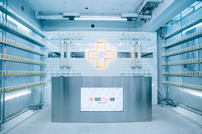
Image Credit: Fast Food Aid
5) Pantone Café
What does color taste like? If anyone knows the answer to that question, it's Pantone. The world's most well-known color company has been running a pop-up café in Monaco for the past two summers, selling a minimal menu of pastries, lunch options, coffees, and fresh juices -- all branded with Pantone's signature color swatches.
So does this mean Pantone is permanently branching out into cuisine? Not quite. The seasonal eatery is perfect Instagram-bait, and it has successfully generated a ton of buzz in the press. It's a perfect example of a pop-up event enabling a company to take creative risks with its brand by stepping outside of its typical business model.
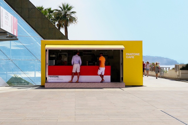
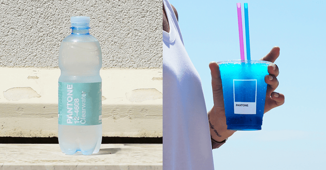
Image Credit: Pantone Café
6) Real Life At Work
To offer passersby a glimpse into its world, London-based ad agency Wieden+Kennedy invited graphic artist Emily Forgot to transform the front window of its office into an imaginative, cartoon-inspired pop-up workspace. Using exaggerated monochrome imagery, Forgot crafted a whimsical office scene from paper, complete with a typewriter and a clock that ran backward.
For a few weeks, real agency employees took turns "working" in the window. The whole thing was then broadcast live via webcam on the agency's website for anyone who was curious enough to watch. The pop-up was a unique way for W+K to shrug off the stereotype of the ad agency that takes itself too seriously -- plus it was a creative chance for the team to engage with the community.
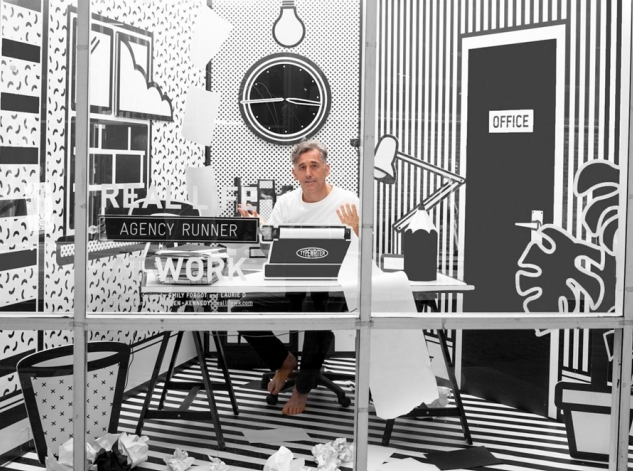
Image Credit: Wieden + Kennedy London
7) Früt
How do you make inexpensive, packaged underwear appeal to high-end consumers? Just create a "luxury" lingerie pop-up with a fake, fancy-sounding name. CP+B Boulder helped client Fruit of the Loom open up an intentionally pretentious and ludicrously over-priced boutique for its underwear, complete with colorful intimates hanging from over-the-top tree displays. Früt sold only Fruit of the Loom undergarments, but shoppers who usually wouldn't deign to buy the brand were lured in by the high-end guise.
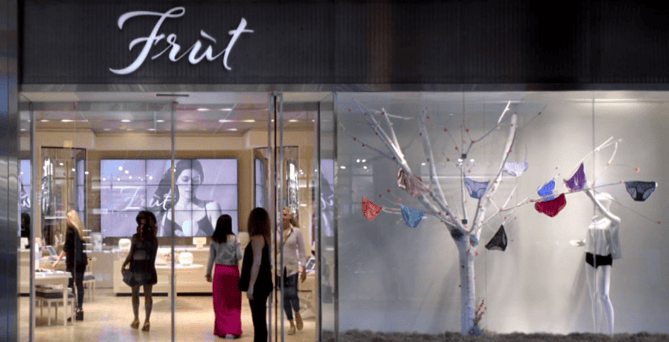
Image Credit: Wieden+Kennedy London
8) Organic Valley Coffee Shop
In a clever shot aimed at the artisanal coffee movement, creative branding agency Humanaut opened up a pop-up cafe to promote its client Organic Valley's new coffee creamer. The temporary Manhattan storefront adhered to all of the typical hipster tropes -- a minimal logo featuring arrows and X's, modern glass mugs, and trendy sizes -- Lil Bit, Double, and Lotta. And they cast a real Organic Valley farmer as the shop's folksy proprietor.
There was one catch: The shop only sold measured portions of half-and-half. You ordered your creamer at the counter from a barista and added your coffee separately. The spoof was a major success. Unperturbed by the irony, New Yorkers lined up to order shots of plain cream for $2 a pop. "No one had a problem paying $2 for a pour of organic half-and-half," said Humanaut's creative chief David Littlejohn. "In the end, the idea wasn't as crazy as we thought it was."
Video Credit: Organic Valley
9) 5-Minute Internship
Solve, a Minneapolis-based creative agency, wanted to re-vamp its summer intern hiring process to attract recruits who can really think on their feet. So naturally, they created a portable, small-scale replica of their office -- complete with a receptionist-staffed micro lobby -- and set off on an epic college-campus road trip.
Students at participating campuses were given a 5-minute challenge based on their area of interest -- and those who performed the best were invited to interview on the spot. The pop-up event tripled the amount of applications the agency received to its internship position.
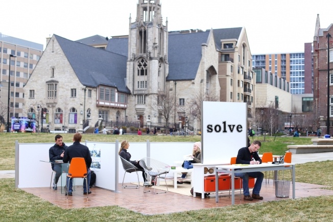
Image Credit: Adweek
10) The Picture House
Capitalizing on the Instagram food photography craze, Birdseye opened up a temporary restaurant in London where diners could settle their bill with an Instagram post -- all they had to do was take a snap of their meal and add the hashtag #BirdsEyeInspirations. The event was a creative social media experiment that helped generate free publicity for the frozen food company's Inspirations line of products. Branding agency Slice was behind the world's first pay-by-picture pop up.
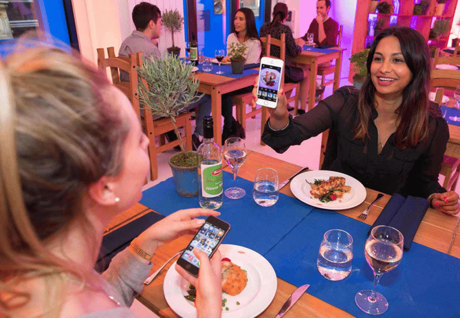
Image Credit: Slice
11) The Period Shop
For one weekend, Kotex launched a pop-up in New York aimed at alleviating negativity and spreading love for women during their periods. The store, which was developed by ad agency Organic, featured ice cream, manicures, chocolate, comfy clothing, and Kotex U products for sale. Women were invited to browse the brightly colored offerings and share their experiences. And it was all for a good cause, too. Proceeds were donated to a women's homeless shelter.
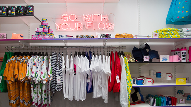
Image Credit: Adweek
12) Birchbox's Tour
Pop-ups give online retailers the chance to show off their goods in person, interact directly with their fans, and take their brand to the next level. Birchbox -- which sells subscription boxes of curated beauty products -- went on a national tour in 2015, opening up temporary brick-and-mortar stores in multiple cities. In addition to selling beauty products, they offered manicures and astrology readings to entice beauty-lovers inside.
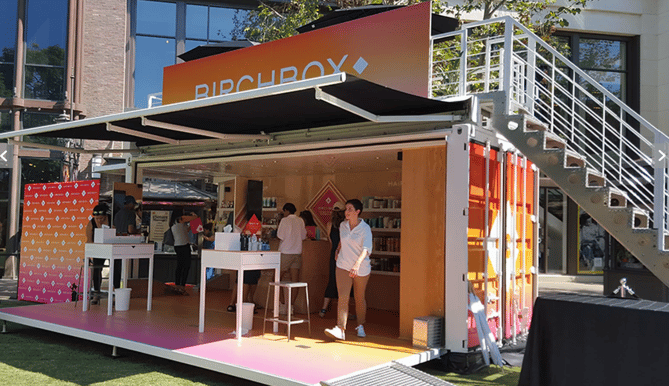
Image Credit: Racked LA
13) Fendi Spring/Summer 2016 Flower Shop
The mobile flower shop that botanical designer Azuma Makoto created for Fendi is proof that not all pop-ups need to be large scale productions. The artist adorned a three-wheeled Italian vehicle with an intricate floral display and outfitted the side of the truck as an open storefront. The vendor/driver sold limited edition Fendi bags and vases of Makoto's floral arrangements to promote the fashion label's 2016 Spring/Summer collection.
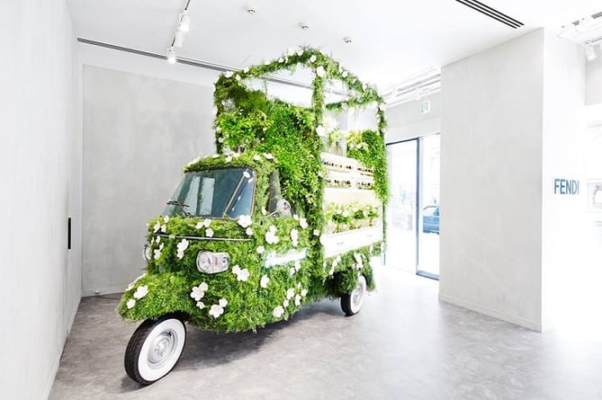
Image Credit: My Modern Met
14) Arnsdorf
What's a designer to do when they're facing a tight budget? Experiment with creative materials. This pop-up retail space for Australian clothier Arnsdorf was created by using 154 pairs of neutral-colored pantyhose, and the effect is otherworldly.
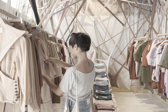
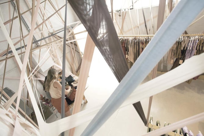
Image Credit: Fast Company
15) The Poundshop
This design collective is a recurring pop-up platform for artists to offer their goods for affordable prices. "The aim of The Poundshop is to spread design to a wider audience by making it accessible through price and engagement," the website explains.
The pop-up shops are just as visually interesting as the art they sell.
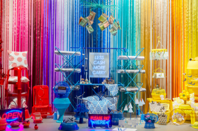
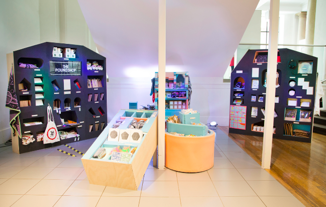
Image Credit: The Poundshop
from Marketing https://ift.tt/2gks69c

No comments:
Post a Comment